Please post no more than five images a day and respond to as many images as you post. Critics, please be constructive, specific, and nice! Moderated by gahspidy and mtbbrian.
By posting on the Photo Critique forum you agree to post only your own photos, be respectful, and give back as much as you receive. This is a moderated forum and anything abusive or
off-topic will be removed.
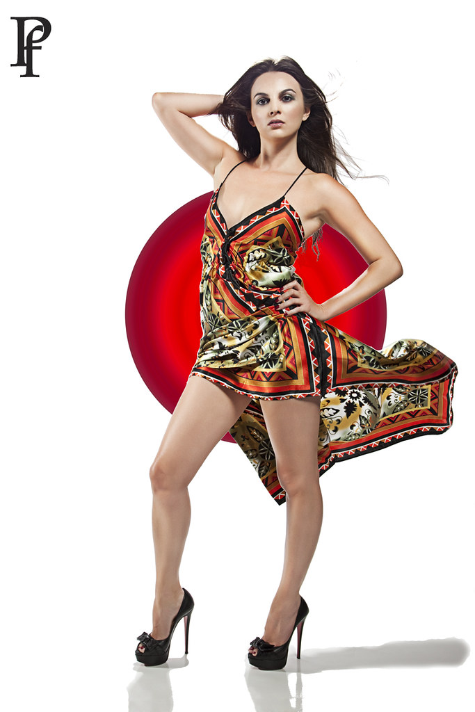
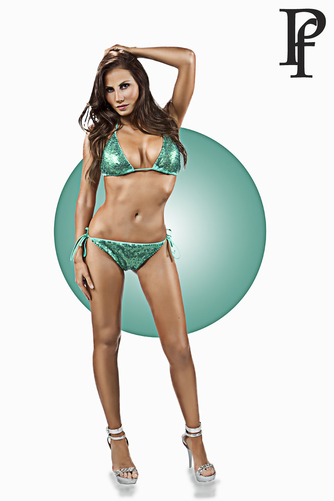
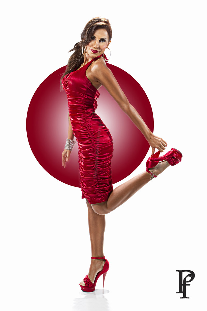
great job. definitely have the 'modern pin up' look. very flattering pictures. They look like they belong in a calendar with that dot in the background. Only nit-pick is the toes. they look like they are lacking color.
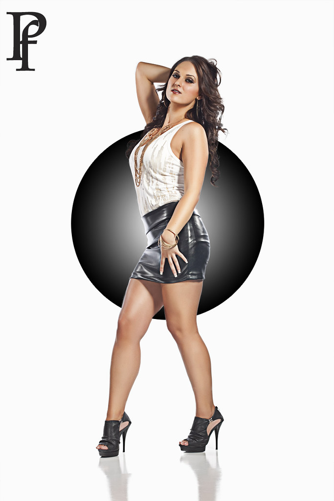
These look fantastic, Phil. Great poses and fine models, although i would say the last one is the weakest of the three.
My only nit is that with the heavy processing, the skin tones take on all sorts of colors and unusual shadings, some of which are flattering and some not. Could be even more profound in print.
aside from my nitpik, these are wonderful.
BTW, how do you like the vinyl white seamless. It appears by the reflection that this is what your using?
I've been using paper, but meaning to experiment with vinyl.
Last edited by gahspidy; 01-23-2011 at 11:32 AM.
Reason: Sticking as Featured Photo. January 23, 2011
These look fantastic, Phil. Great poses and fine models, although i would say the last one is the weakest of the three.
My only nit is that with the heavy processing, the skin tones take on all sorts of colors and unusual shadings, some of which are flattering and some not. Could be even more profound in print.
aside from my nitpik, these are wonderful.
BTW, how do you like the vinyl white seamless. It appears by the reflection that this is what your using?
I've been using paper, but meaning to experiment with vinyl.
thank you.
HONESTLY....I was trying to imitate a photographer's work that I really admire and FAILED miserably. LOL
this guy...... I FAILED but at least I explored and found new computer skills LOL.
so the green picture was the first experiment then the red then the black. If you look at the last one its way cleaner and softer than the other pictures.... which was better than the green and red.... I'm still exploring until I get what I want. YEP..that issue of the weird skin tones....trying to get it cleaner and softer.
I am using a white tileboard which I bought from LOWE"S for $11 for a 4'x8' for the floor and an ordinary seemless for the bg. I just cleaned it during PP to match both shade.
Ok, yes i noticed the processing was really much better, and very good actually in the last. i just thought the first two models had the better character and poses for this.
Yep, I am familar with Alvarados work.
Ha, i have been back and forth to Lowes as well looking and experimenting with various items. Picked up a Faux brick wall panels, and have yet to give that a good testing.
Keep up the fine work, Phil..
thank you, Gary.
I showed Robert Alvarado that last one to see if I get any violent reaction from him ... LOL
He said I did a great job. It made my day. Now it even inspired me more to really work on an image to make it right (in my eyes)
I am probably happy with this now.... took time cleaning the skin
I don't know what you guys do to turn women to look like wax figures, and if that is a good thing?. I think the one in yellow floral dress with red background (minus the red background) followed by the one in black skirt are the most natural looking than the rest. I think top magazines will refrain from publishing them because of the unnatural look.
I don't know what you guys do to turn women to look like wax figures, and if that is a good thing?. I think the one in yellow floral dress with red background (minus the red background) followed by the one in black skirt are the most natural looking than the rest. I think top magazines will refrain from publishing them because of the unnatural look.
it suppose to look like they are drawn or illustrated just like the old pin up drawings from the 50s but with a modern twist.
Robert Alvarado made it popular and is pretty successful and even holding clinics all around America.
It's what you call modern pin up. I've seen it published a lot in Tatoo magazines too.
...originated from the old works of Alberto Vargas ....
google both names.
if you want to see wax skins? google the top fashion photographers in the world and look at their ports you see wax skin all over the place and these guys are published and hired by top designers of the world.
Congrats on the sticky. Been meaning to comment on this one.
I like the idea. The images are pretty much what you were going for, very 40s to me, but with a modern clothing line.
To be critical now, I think they're a tad plain though I'm not sure why and what I could suggest to improve them (I am violating a law here - don't criticize unless you can say how to improve it). If I had to guess though, the models seem to just be standing there esp the gal in the aqua blue. I mean, with a model like that, maybe that's OK. But it could use some sort of creative twist - what, I don't know.
Anyway, great technique and they are snazzy.
G
Photography Software and Post Processing Forum Moderator. Visit here!
-----------------------------------------------------------------------------------------
Feel free to edit and repost my photos as part of your critique.
-----------------------------------------------------------------------------------------
Congrats on the sticky. Been meaning to comment on this one.
I like the idea. The images are pretty much what you were going for, very 40s to me, but with a modern clothing line.
To be critical now, I think they're a tad plain though I'm not sure why and what I could suggest to improve them (I am violating a law here - don't criticize unless you can say how to improve it). If I had to guess though, the models seem to just be standing there esp the gal in the aqua blue. I mean, with a model like that, maybe that's OK. But it could use some sort of creative twist - what, I don't know.
Anyway, great technique and they are snazzy.
G
thanks G...... I want to get out of that typical pinup poses too... I think there should be no rule and people follow you base on your own personal style. I want to combine fashion in pin up if that makes any sense. I have a couple of personal projects lined up so it's gonna be fun exploring them.


 LinkBack URL
 About LinkBacks


 Reply With Quote