Please post no more than five images a day and respond to as many images as you post. Critics, please be constructive, specific, and nice! Moderated by gahspidy and mtbbrian.
By posting on the Photo Critique forum you agree to post only your own photos, be respectful, and give back as much as you receive. This is a moderated forum and anything abusive or
off-topic will be removed.
Feel Free TO EDIT My Photos, But Please Tell Me Why
I have gone over to the dark side, no more film.
Canon T2i, 18-135 IS
Digital Point&Shot - Canon Powershot A470
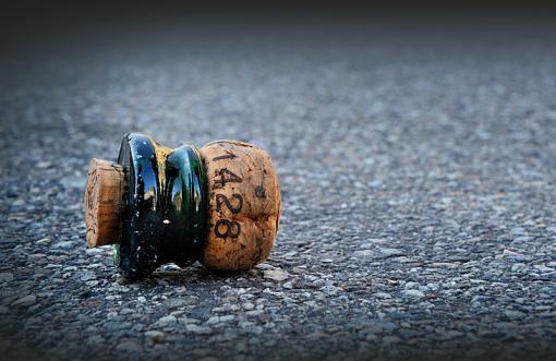
I have to go with the color one myself. In the color one there is more detail in the colored rings and the reflection in them. The background is about the same in both photos but I think the color brings out the subject more to me, Jeff
Check out my websiteHere My Nikon D7000 Tips thread is HERE
All images posted by me anywhere are Copyrighted by Federal Law and may not be copied or used in ANY FORM without my personal written permission.Jeff Impey "I decided years ago I was only going to have two types of days...Very Good Daysor just Plain Good DaysI just refuse to have Bad Ones!!! :thumbsup: :thumbsup:
I'm afraid I'm not going to be of much help here. I just can't decide.
EDIT: Upon second look, I think I'm leaning toward the color one for some of the reasons that Grandpaw mentioned. It has more detail and impact. I might play with the color balance a little to see what variations I could come up with.
Last edited by draymorton; 11-28-2009 at 10:12 PM.
Tough call, at first glance I preferred the B&W but now I dont know, both have different flavors I guess, depends what mood you want to express.
...Oh! Here it comes BlueRob with his strange ideas....What a about a color subject with a monotone (B&W) background?
Well thanks, we are basically split here so I don't know which to end up posting as I don't want to post both to my gallery. Frog, Jetrim, Engineer, W. Slayman, Grandpaw, Draymorton and BlueRob, thanks to you all for taking a moment to post your thoughts, I'm grateful as always. Blue Rob, I would have gone for the colour for just the cork and glass and left the background B&W, but I've heard recently that that's not the thing to do these days, right Draymorton...I do like the tinge of green in the glass, shoot just don't know what to do, I just liked the simplicity of the subject and background. I'll play around with the colour and tones of both and then go with one I feel good about. Stay tuned. Cheers, Shootme
:thumbsup: Shootme...
Please don't edit and re-post or use my images (not that you'd want to anyway...). without my written permission. Thank you
When I looked at the title of your thread, I thought, ah, this will be easy. Color. Then I looked. This is a tough call. They both appeal to me. But if I were forced to pick, then I would have to pick 2.
________________________
Paula
Your editing is welcomed. A picture is worth...
All can look. Few will see. Less will know.
The Truth can be anything it will. I just want to know Truth.
I agree Paula, at first I only had it in colour and thought nice simple and candid shot. Then I looked at it in B&W and thought no this is really nice in B&W too. Then the dilemma and you'd wonder why as it's not an intricate shot...or is it? Thanks
:thumbsup: Shootme...
Please don't edit and re-post or use my images (not that you'd want to anyway...). without my written permission. Thank you
Thanks Ptax, I too like B&W, but this time I went with Colour as I wasn't able to give more punch to the B&W which I would have liked. AgingEyes I think you right on this one. So I'd guess you'd have picked the B&W if it had more punch? Cheers and thanks. S
:thumbsup: Shootme...
Please don't edit and re-post or use my images (not that you'd want to anyway...). without my written permission. Thank you
would you like me to send you the original raw file.
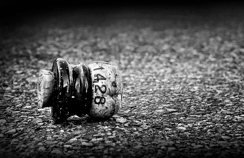
Thank you for your permission and the suggestion, Peter ! I was fine working with the color jpeg you'd posted. Basically just wanted to share another possibility of what the b&w of that image could look like:
I find this one looks better on black background
I used channel mixer for this one, enhanced contrast, then ran it through Silver Efex to use some of the features there (structure and film type). Added vignetting and applied sharpening. I didn't do any clean-up.
If you want to add contrast to yours, just use "Levels" or "Curves".
Thank you for your permission and the suggestion, Peter ! I was fine working with the color jpeg you'd posted. Basically just wanted to share another possibility of what the b&w of that image could look like:...
Added vignetting and applied sharpening. I didn't do any clean-up.
If you want to add contrast to yours, just use "Levels" or "Curves".
Wow it has so much more punch in it, Yes I like it too. Thanks for doing that. I will try and simulate what you have done. Feel free to use the two examples a teaching prompt. S
Last edited by shootme; 12-01-2009 at 03:34 AM.
:thumbsup: Shootme...
Please don't edit and re-post or use my images (not that you'd want to anyway...). without my written permission. Thank you
After AgingEyes has worked on this I think I just may have changed my mind and prefer this version of the B&W over the color. It now has the punch that was needed, Jeff
Check out my websiteHere My Nikon D7000 Tips thread is HERE
All images posted by me anywhere are Copyrighted by Federal Law and may not be copied or used in ANY FORM without my personal written permission.Jeff Impey "I decided years ago I was only going to have two types of days...Very Good Daysor just Plain Good DaysI just refuse to have Bad Ones!!! :thumbsup: :thumbsup:
Now you have gone and doubled the punch, I liked the original B&W but love this one, great photo.
Bill,
Feel Free TO EDIT My Photos, But Please Tell Me Why
I have gone over to the dark side, no more film.
Canon T2i, 18-135 IS
Digital Point&Shot - Canon Powershot A470
The increased vignetting and the more pronounced blacks make AgingEyes edit work for me.
I think his eyesight is much better than his handle would suggest.


 LinkBack URL
 About LinkBacks


 Reply With Quote