Please post no more than five images a day and respond to as many images as you post. Critics, please be constructive, specific, and nice! Moderated by gahspidy and mtbbrian.
By posting on the Photo Critique forum you agree to post only your own photos, be respectful, and give back as much as you receive. This is a moderated forum and anything abusive or
off-topic will be removed.
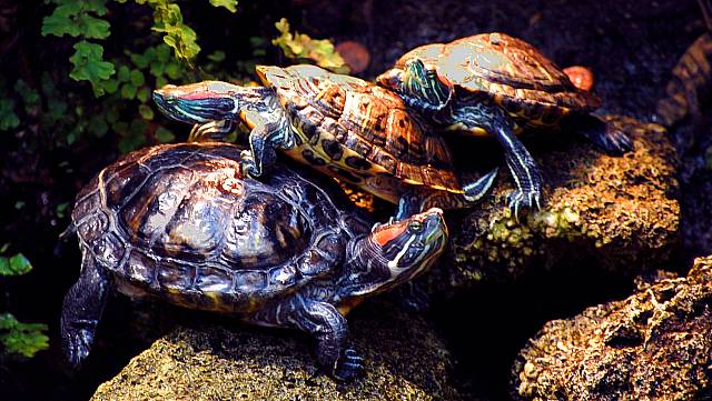
I love turtles. and I love how the turtles are stacked.... but I am not digging the color. It looks fake. Is there a way to dull the color a little back towards nature?... other wise I love the compisition and the subject just having trouble with the color!
I really love how the one looks like his back leg will slide off any minute!...
" In Germany they first came for the communists, and I didn't speak up because I wasn't a communist. Then they came for the Jews, and I didn't speak up because I wasn't a Jew. Then They came for the trade unionists, and I didn't speak up because I wasn't a trade unionists. Then they came for the Catholics and I didn't speak up because I was a Protestant. Then they came after me- and by that time NO ONE WAS LEFT TO SPEAK UP."
( Pastor Martin Niemoller)
I agree with the other critic. I think this would be a great shot if left as taken before the post-processing. The colors are over the top, and you've got a major issue with the shell on the top turtle. The composition is excellent, and I'd be interested in knowing your decisions with the processing.


 LinkBack URL
 About LinkBacks


 Reply With Quote
