Photo Critique Forum

Please post no more than five images a day and respond to as many images as you post. Critics, please be constructive, specific, and nice! Moderated by gahspidy and mtbbrian.
Featured Photo
Photo by hminx

Photo by hminx
Featured Photo Archive >>
By posting on the Photo Critique forum you agree to post only your own photos, be respectful, and give back as much as you receive. This is a moderated forum and anything abusive or off-topic will be removed.
Results 1 to 6 of 6

Thread: " Preference?

  1. #1
    Member New England Moments's Avatar
    Join Date
    Apr 2008
    Location
    Vermont
    Posts
    59

    " Preference?

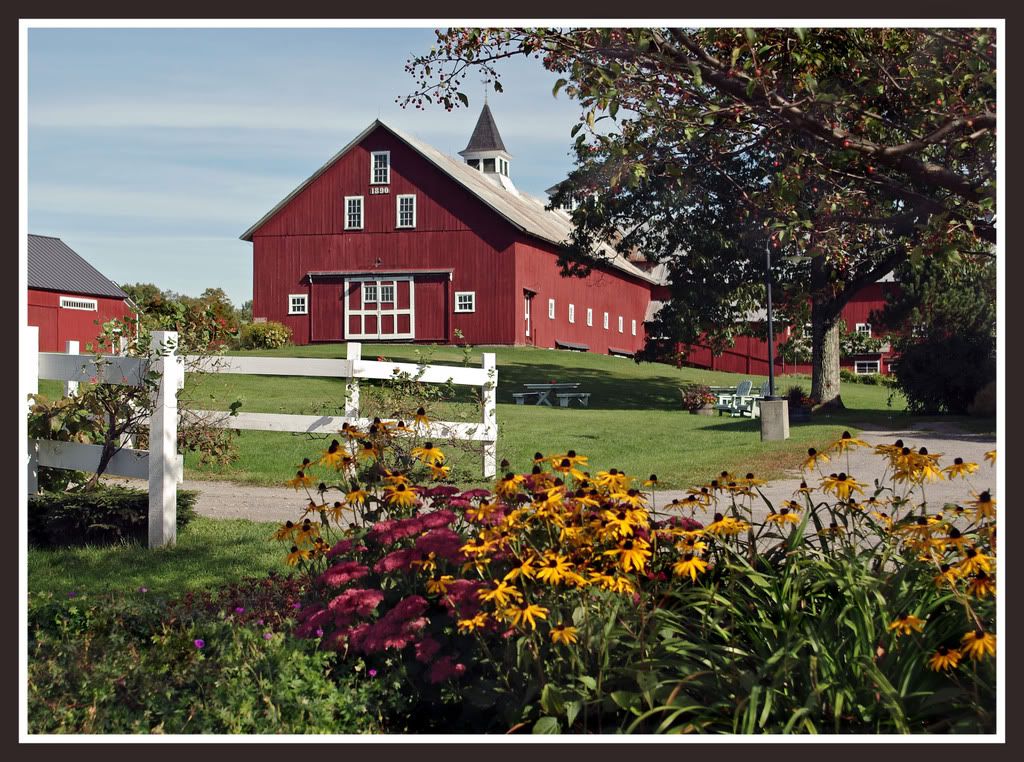
    Two of a Barn here in Vermonts" Northeast Kingdom, both taken with a Moose Filter, which is actually a Polarizer, Warm Filter Combo..

    Maybe neither rock your Boat?


  2. #2
    Senior Member jkriminger's Avatar
    Join Date
    Apr 2007
    Location
    Davie, Fl
    Posts
    1,202

    Re: " Preference?

    Number 1 is a lil fuzzy in foreground..aperture?. I like the apples jumping off the screen in number 2.
    Please ask to edit photos and I'll do the same! :thumbsup:
    Thx, Rod
    http://krimingerphotography.printroom.com

  3. #3
    Spamminator Grandpaw's Avatar
    Join Date
    Feb 2004
    Location
    Mississippi Gulf Coast, USA
    Posts
    4,808

    Re: " Preference?

    I agree the second one is sharper but I like the composition of the first one better. I like the fact that it is closer and doesn't have all the empty space up front. My eye goes to the barn in the first one but gets drawn to much to the apple tree in the second photo. I do wish the first one was a little sharper though, Jeff
    Check out my website Here
    My Nikon D7000 Tips thread is HERE

    All images posted by me anywhere are Copyrighted by Federal Law and may not be copied or used in ANY FORM without my personal written permission. Jeff Impey
    "I decided years ago I was only going to have two types of days... Very Good Days or just Plain Good Days I just refuse to have Bad Ones!!! :thumbsup: :thumbsup:

  4. #4
    Senior Member jetrim's Avatar
    Join Date
    Jul 2008
    Location
    Ft. Lauderdale
    Posts
    3,229

    Re: " Preference?

    I like the first one, though it could use a bit more depth of field as others have mentioned, the composition is great though.

    The second one it seems the subject gets a bit lost being so far away and is definately upstaged by the apple tree in the lower left. Actually, I think that cropping out the main barn to leave the apple tree framing the adarondack chairs with the small garage beyond would make a very nice vertically oriented shot.

  5. #5
    GB1
    GB1 is offline
    Moderator GB1's Avatar
    Join Date
    Feb 2004
    Location
    San Diego CA
    Posts
    9,960

    Re: " Preference?

    I agree that the composition is more interesting in # 1 than 2, but that the blurry foreground hurts the shot. *Not* that it would always hurt it .. sometimes blur is good. I am not sure of # 1 overall though.. the lighting seems muted and it gives me a feeling of confusion with all the objects coming in at different angles and its multiple planes. # 2 is nice but the barn seems a bit small / far away here.

    Overall though, very well done photos. I love the sharpness, "matting" and "framing."

    NEM, not to be overally harsh here, but I've never seen you critique others' work on the photo critique board... Don't know if you feel uncomfortable doing so or not, but it would be nice to give back some advice and viewpoints.

    -Gb
    Photography Software and Post Processing Forum Moderator. Visit here!

    -----------------------------------------------------------------------------------------
    Feel free to edit and repost my photos as part of your critique.
    -----------------------------------------------------------------------------------------

    My Site

  6. #6
    Member Ptax's Avatar
    Join Date
    Dec 2007
    Location
    Springfield, missouri
    Posts
    392

    Re: " Preference?

    I like #2 better. The first shot too many elements in too close a space It seems a bit busy.

    #2 has several elements also- apple tree, Adirondack chairs, barn, etc, but there is space between the elements. I also like the way the apple tree frames the Adirondack chairs.

Thread Information

Users Browsing this Thread

There are currently 1 users browsing this thread. (0 members and 1 guests)

Posting Permissions

  • You may not post new threads
  • You may not post replies
  • You may not post attachments
  • You may not edit your posts
  •