LinkBack URL
 About LinkBacks

Comments and critique are welcome, suggestions cheerfully explored.
Results 1 to 8 of 8
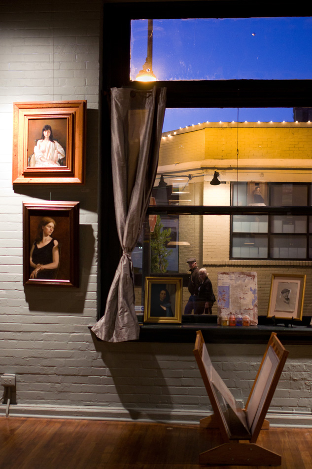
Thread: The Portraits' View
Thread InformationUsers Browsing this ThreadThere are currently 1 users browsing this thread. (0 members and 1 guests)
|
|||||||

 Reply With Quote