Please post no more than five images a day and respond to as many images as you post. Critics, please be constructive, specific, and nice! Moderated by gahspidy and mtbbrian.
By posting on the Photo Critique forum you agree to post only your own photos, be respectful, and give back as much as you receive. This is a moderated forum and anything abusive or
off-topic will be removed.
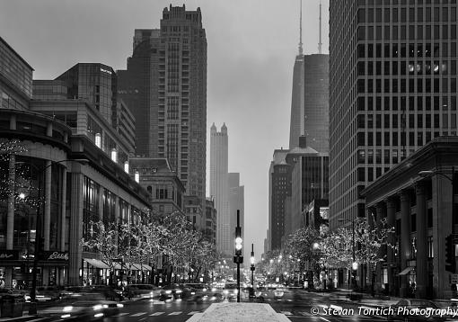
Stevan, this one took me awhile to decide that I like it. The ghost-like vehicle action becomes the subject, but I'm not sure if that is what you intended. The black and greyscale tones across the image are well-done. The distant grey is a bit distracting, as I can't figure out if I'm seeing rain, fog, or digital noise! I find myself wanting to see a little more of the architecture of the near buildings left and right, so may a little wider perspective would be more telling. Overall, I think it is well done.
Ken
My Website: His Creation
"You miss 100% of the shots you don't take." Wayne Gretzky
I think this would look great printed really big, poster size or larger. Only thing would prefer is a bit more texture in the sky. Possibly a luminosity mask layer to isolate the sky and "multiply" layer blend mode.
Pete
Isn't it a cool thing in nature that the colours never seem to clash...


 LinkBack URL
 About LinkBacks


 Reply With Quote


