Please post no more than five images a day and respond to as many images as you post. Critics, please be constructive, specific, and nice! Moderated by gahspidy and mtbbrian.
By posting on the Photo Critique forum you agree to post only your own photos, be respectful, and give back as much as you receive. This is a moderated forum and anything abusive or
off-topic will be removed.
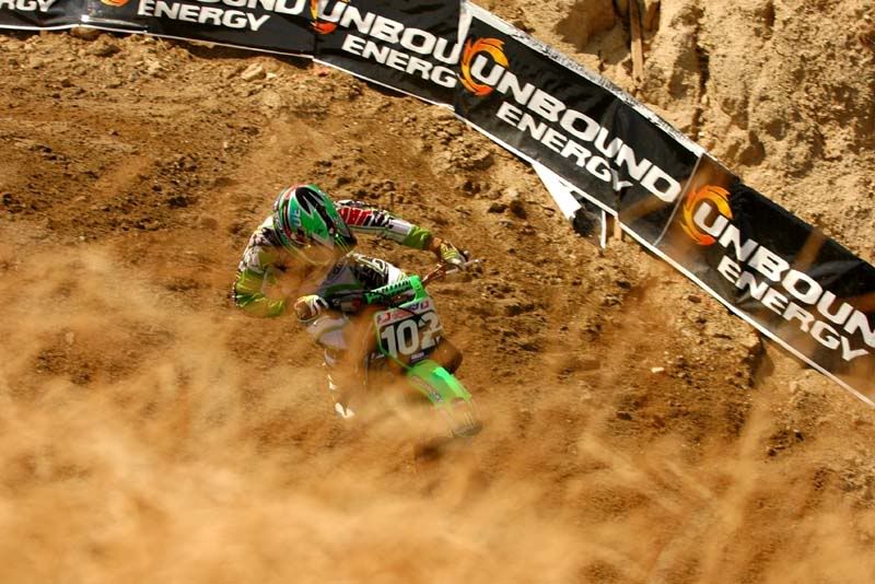
I like the way the path markers lead you through this image. The exposure looks good and placement of the subject is fine. The only suggestion I have are the distraction of the foreground, (not sure what it is and it takes away from the image) removing this would give us a better idea of what the rider is doing. Because of your angle and the foreground I’m assuming he is sliding through the turn but it is not clear. Hope this helps.
Good subject. Good background. Wrong angle (but not sure you could do anything about it).
If you could have shot this from a side view and zoomed in to the biker more, with the banners behind her (or her), it might really have been interesting. A little too much dirt here for me, the earth colors dont complement the green and the contemporary style of the banner. If the foreground bushes were a different color I might like them more.
Subjects like this always sound good, but they can get cliche pretty fast and I find that one of the best ways to make them exciting is to try to capture the human element - the rider concentrating, sweating, etc. Movement is also good - blurring, panning, etc.


 LinkBack URL
 About LinkBacks


 Reply With Quote

