Please post no more than five images a day and respond to as many images as you post. Critics, please be constructive, specific, and nice! Moderated by gahspidy and mtbbrian.
By posting on the Photo Critique forum you agree to post only your own photos, be respectful, and give back as much as you receive. This is a moderated forum and anything abusive or
off-topic will be removed.
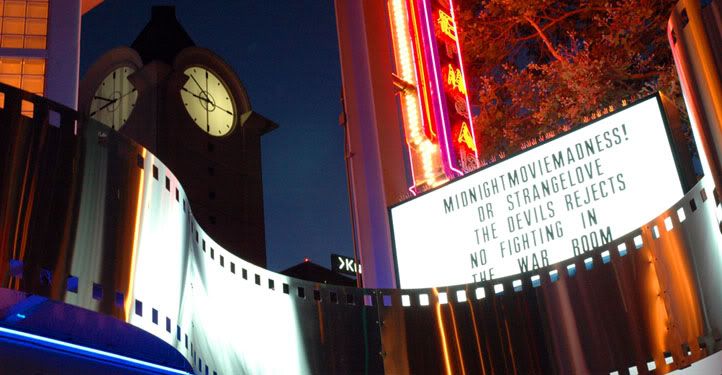
Like the colors, composition and perspective. The sign, light bulbs and reflection seem a little blown out though. However, I am really not qualified to give critique, just my opinion.
Great composition on this, I like how everything is very tight. I'm not a person that typically likes color photos, however you did a excellent job on this and it has a very nice intensity. I don't believe the lights are too blown out, I think you would of lost some detail in others areas to fix that.
I would have liked to have seen the hour (clock) a bit closer to midnight...but that is just a minor nit pick or personal preference.
Good job.
Cheers.
I'm always mentally photographing everything as practice.
Minor White
Yes, I bracketed this shot and found this to be the best looking. I needed to bring out all the details, thus the bright lights. It would have been nice to have the clock closer to midnight, true.. then again, this was a relatively spontaneous shot. Thanks again!


 LinkBack URL
 About LinkBacks

 Reply With Quote


