Please post no more than five images a day and respond to as many images as you post. Critics, please be constructive, specific, and nice! Moderated by gahspidy and mtbbrian.
By posting on the Photo Critique forum you agree to post only your own photos, be respectful, and give back as much as you receive. This is a moderated forum and anything abusive or
off-topic will be removed.
Don - I sometimes zero in on posts that have no responses, so figured I'd check this one out.
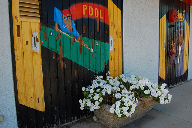
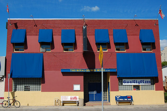
I think the subject matter is worthy in both. I don't particularly like your composition or angle on the top one, seems too 'shot from head elevation/ 5 feet above the ground.' The flowers also seem more in the way than complimentary.
Number 2 is better - I like the simplistic, flat look that the sun has on this building (also caused by the paint) and the soothing colors of the brick and the blue window coverings. I am not sure about the angle it has - I think the ideal shot here would have been a direct angle, perhaps you shooting it from 15 feet up (however you would pull that off!). It also seems a bit basic in how much space you left on the sides. There are more creative croppings that you could have used -- use your imagination. I like how no one is in the shot.
G
Photography Software and Post Processing Forum Moderator. Visit here!
-----------------------------------------------------------------------------------------
Feel free to edit and repost my photos as part of your critique.
-----------------------------------------------------------------------------------------


 LinkBack URL
 About LinkBacks


 Reply With Quote
