Please post no more than five images a day and respond to as many images as you post. Critics, please be constructive, specific, and nice! Moderated by gahspidy and mtbbrian.
By posting on the Photo Critique forum you agree to post only your own photos, be respectful, and give back as much as you receive. This is a moderated forum and anything abusive or
off-topic will be removed.
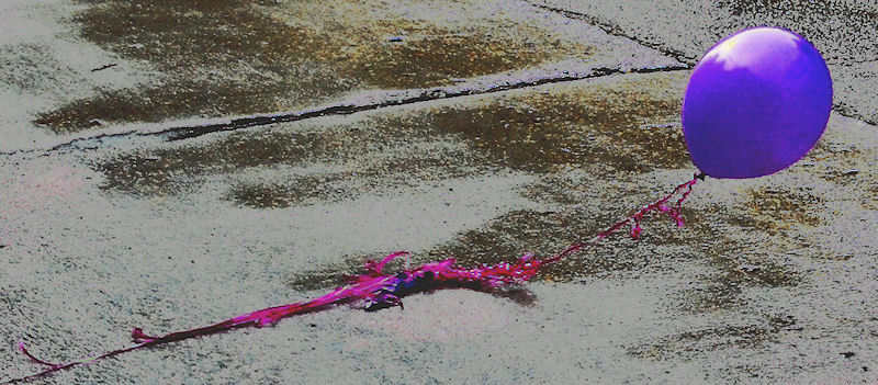
Its a great subject, Don. I feel that it needs some more space around it as it looks too confined now. the post processing might be a tad heavy for my taste, but the colors and textures do work here.
Really, I think just a little more space all around would be the trick
The tones look unpleasantly rough, artificial and gloomy. I like the composition, subject, and the way the balloon intersects the crossing lines. The edges of the balloon seem fake, and the detail in the string is a bit lost through post processing. Could you post the original?


 LinkBack URL
 About LinkBacks


 Reply With Quote


