Photo Critique Forum

Please post no more than five images a day and respond to as many images as you post. Critics, please be constructive, specific, and nice! Moderated by gahspidy and mtbbrian.
Featured Photo
Photo by hminx

Photo by hminx
Featured Photo Archive >>
By posting on the Photo Critique forum you agree to post only your own photos, be respectful, and give back as much as you receive. This is a moderated forum and anything abusive or off-topic will be removed.
Results 1 to 7 of 7

Thread: Temple.

  1. #1
    Member
    Join Date
    Jan 2013
    Location
    Malaysia
    Posts
    59

    Temple.

    Temple.-dsc_7096.jpg


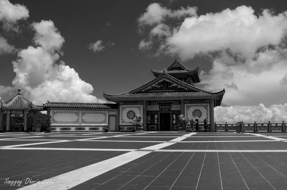
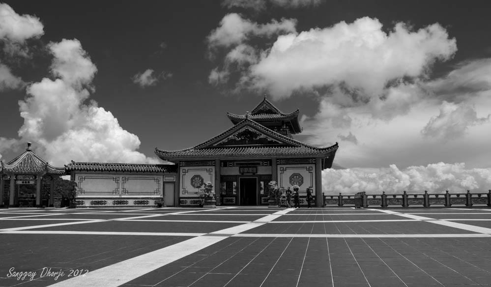
    This is a small part of a temple. I shot this because of the floor lines and the clouds. I know afternoon is not the best time to shoot, it was an impromptu visit after lunch with family members.

    Any feedback will be very much appreciated.

  2. #2
    Ken ksbryan0's Avatar
    Join Date
    Dec 2009
    Location
    Delphia, MT USA
    Posts
    1,160

    Re: Temple.

    I like this one, Sanggay. The leading lines work very well and the clouds are great. I'd suggest trying out some different crops to get the main temple building off dead-center of the image...maybe move it to the right. There is a lot to explore in the image, well done.
    Ken

    My Website: His Creation
    "You miss 100% of the shots you don't take." Wayne Gretzky

  3. #3
    Member
    Join Date
    Jan 2013
    Location
    Malaysia
    Posts
    59

    Re: Temple.

    Quote Originally Posted by ksbryan0 View Post
    I like this one, Sanggay. The leading lines work very well and the clouds are great. I'd suggest trying out some different crops to get the main temple building off dead-center of the image...maybe move it to the right. There is a lot to explore in the image, well done.
    How about this? I don't want to lose the clouds.

    Temple.-dsc_7096-2.jpg

  4. #4
    Senior Member hminx's Avatar
    Join Date
    Jan 2009
    Location
    New Zealand
    Posts
    2,154

    Re: Temple.

    I think this would have been a lot stronger if the leading lines led to the door rather than the corner of the building. there are a lot of long straight lines and if you don't get it right they are going effect the image as in this case where they pull you to the corner when your eye wants to go to the door as its is the centre point of the building.
    As ken said the clouds are nice but the image looks like you have exposed for them which makes the temple a little under exposed in my opinion. Still having said that, it's a very nice image and I enjoyed viewing it. Wondering if you had a colour version ?
    Pete

    Isn't it a cool thing in nature that the colours never seem to clash...

    I have no issues with you editing my photos

  5. #5
    Senior Member
    Join Date
    Oct 2010
    Location
    Chicago, IL, USA
    Posts
    595

    Re: Temple.

    I usually write my opinion without reading others first - so I am doing the same here. The BW conversion here is a good idea because of those great white clouds that definitely add to the scene. Considering our eye is usually drawn to the bright areas first, and looking at the floor - using the broader brighter white lines to take us to the temple may have worked better - they are little bit off to the side. Also, I would consider a different composition - perhaps focusing on the big building only, and having it perfectly centered, or having it off to the side without the smaller building. Nice BW conversion, though.

  6. #6
    Member
    Join Date
    Jan 2013
    Location
    Malaysia
    Posts
    59

    Re: Temple.

    Quote Originally Posted by llewpics View Post
    I usually write my opinion without reading others first - so I am doing the same here. The BW conversion here is a good idea because of those great white clouds that definitely add to the scene. Considering our eye is usually drawn to the bright areas first, and looking at the floor - using the broader brighter white lines to take us to the temple may have worked better - they are little bit off to the side. Also, I would consider a different composition - perhaps focusing on the big building only, and having it perfectly centered, or having it off to the side without the smaller building. Nice BW conversion, though.
    Thanks for looking and the feedback. I agreed that the lines are a bit off.
    I will re shoot if I have the chance to go back there again. This is the color version.

    Temple.-dsc_7096-4.jpg

  7. #7
    Junior Member
    Join Date
    Apr 2013
    Posts
    14

    Re: Temple.

    It feels a little hard to me, maybe softening the focus in the foreground might help?

Thread Information

Users Browsing this Thread

There are currently 1 users browsing this thread. (0 members and 1 guests)

Posting Permissions

  • You may not post new threads
  • You may not post replies
  • You may not post attachments
  • You may not edit your posts
  •