Photo Critique Forum

Please post no more than five images a day and respond to as many images as you post. Critics, please be constructive, specific, and nice! Moderated by gahspidy and mtbbrian.
Featured Photo
Photo by hminx

Photo by hminx
Featured Photo Archive >>
By posting on the Photo Critique forum you agree to post only your own photos, be respectful, and give back as much as you receive. This is a moderated forum and anything abusive or off-topic will be removed.
Results 1 to 8 of 8
  1. #1
    Looking... dwaugh's Avatar
    Join Date
    Feb 2006
    Location
    Bellingham, WA, USA
    Posts
    481

    Take 2: Time and Money - Pt. 2

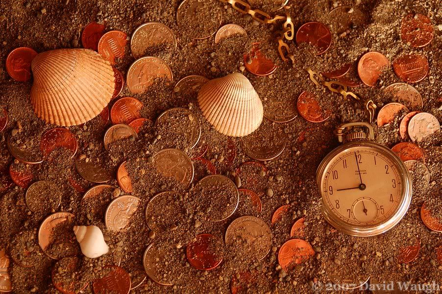
    I finally got around to re-taking the time and money shot which I posted last week. Click here if you want to see the original shot again. I took the comments and removed some pennies and put in some dimes, as well as made the lighting better so that it is not blown out anymore. Let me know what you think.


    QUESTION: Is it just my computer, or does the photo not show up for anyone else? Recently, my photos have not loaded within the IMG tags - including one that had worked before.
    Last edited by dwaugh; 02-15-2007 at 01:25 PM.
    My Facebook Photography Page (Web-substitute) ~ Nikon D7000 | Sigma 10-20mm | Vivitar 28-85mm | Sigma 70-300mm Macro ~

  2. #2
    Panarus biarmicus Moderator (Sports) SmartWombat's Avatar
    Join Date
    Mar 2004
    Location
    UK
    Posts
    11,750

    Re: Take 2: Time and Money - Pt. 2

    Shows for me.
    Good to see the shells not blown out this time.
    PAul

    Scroll down to the Sports Forum and post your sports pictures !

  3. #3
    Not-so-recent Nikon Convert livin4lax09's Avatar
    Join Date
    Dec 2004
    Location
    NH
    Posts
    2,776

    Re: Take 2: Time and Money - Pt. 2

    good composition, good style, just needs a bit of curves to make it pop!

  4. #4
    Looking... dwaugh's Avatar
    Join Date
    Feb 2006
    Location
    Bellingham, WA, USA
    Posts
    481

    Re: Take 2: Time and Money - Pt. 2

    Quote Originally Posted by livin4lax09
    good composition, good style, just needs a bit of curves to make it pop!
    Curves? I'm not sure how I could make that happen...:idea:
    My Facebook Photography Page (Web-substitute) ~ Nikon D7000 | Sigma 10-20mm | Vivitar 28-85mm | Sigma 70-300mm Macro ~

  5. #5
    To Capture the Mind! MarcusK's Avatar
    Join Date
    Jul 2006
    Location
    Lebanon / The World
    Posts
    686

    Re: Take 2: Time and Money - Pt. 2

    Much better....very well done...

    Pop, is also a matter of perspective,... it could yet it doesnt need it.....

    Marc
    Marc

    "Perfection is achieved, not when there is nothing left to add, but rather, when there is nothing left to take away." - Antoine de St-Exupery

    Kindly do NOT edit my photos - I would rather try and apply your advice and learn...

    My Ramblings....

  6. #6
    Senior Member Ronnoco's Avatar
    Join Date
    Mar 2004
    Location
    Canada
    Posts
    1,752

    Re: Take 2: Time and Money - Pt. 2

    Nice detail on the coins, so you certainly improved the lighting. The only suggestion I would make is to cool down the colour temperature a little.

    Ronnoco
    www.photoinf.com

    Accepted photo standards in technique and composition are the tools used to judge photo quality.

  7. #7
    Member lalotafoya's Avatar
    Join Date
    Apr 2006
    Location
    bakersfield CA USA
    Posts
    464

    Re: Take 2: Time and Money - Pt. 2

    This is verry good, I like the composition, however the color of the quarters is off to me, i would like to see the quarters shine more. The color of the pennes is okay, the color of the dimes is off too.,I know that it is hard to put light on a shinny quarter and still get the right detail, I don't know what you could have done differnt to improve the lighting, but if you change that maybe you can get the right color..
    Lalo

  8. #8
    Looking... dwaugh's Avatar
    Join Date
    Feb 2006
    Location
    Bellingham, WA, USA
    Posts
    481

    Re: Take 2: Time and Money - Pt. 2

    Quote Originally Posted by lalotafoya
    This is verry good, I like the composition, however the color of the quarters is off to me, i would like to see the quarters shine more. The color of the pennes is okay, the color of the dimes is off too.,I know that it is hard to put light on a shinny quarter and still get the right detail, I don't know what you could have done differnt to improve the lighting, but if you change that maybe you can get the right color..
    Others have said that and I agree. I used the right white balance for the type of light I used, so I think what I would do is play around with it on my computer and see what I can do for the colors. I've done it before on a similar shot but I forget exactly what I did. I'll just have to figure it out and maybe post it as a reply when I get around to it. I basically just need to make the silver coins look more silver, without messing up the pennies too much, and keeping the warm glow that the photo has.
    My Facebook Photography Page (Web-substitute) ~ Nikon D7000 | Sigma 10-20mm | Vivitar 28-85mm | Sigma 70-300mm Macro ~

Thread Information

Users Browsing this Thread

There are currently 1 users browsing this thread. (0 members and 1 guests)

Posting Permissions

  • You may not post new threads
  • You may not post replies
  • You may not post attachments
  • You may not edit your posts
  •