Please post no more than five images a day and respond to as many images as you post. Critics, please be constructive, specific, and nice! Moderated by gahspidy and mtbbrian.
By posting on the Photo Critique forum you agree to post only your own photos, be respectful, and give back as much as you receive. This is a moderated forum and anything abusive or
off-topic will be removed.
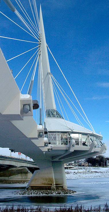
That is some really weird and modernistic bridge furniture - space age indeed! What exactly is it? You have kept it looking very crisp and cold, and the different shades of white/silver/grey are all well rendered.
About the only thing that bothers me a little is the bridge which you can see in the bottom right. I appreciate though that if you moved to get a different angle, then you would lose the strutting/cabling which is part of the image - not sure how you would get around that.
Another well composed shot. Great idea for an angle shooting from where you did, under the walkway, I like the angles of the supports and the position of the building, also adding to the picture is where you placed the water and little tad of grass in the foreground. The image does appear to be a little grainy or over sharpened some. You have my vote for most improved photographer for 2006. Nice work Don,
Greg
I am like Barney Fife, I have a gun but Andy makes me keep the bullet in my pocket..


 LinkBack URL
 About LinkBacks


 Reply With Quote


