Please post no more than five images a day and respond to as many images as you post. Critics, please be constructive, specific, and nice! Moderated by gahspidy and mtbbrian.
By posting on the Photo Critique forum you agree to post only your own photos, be respectful, and give back as much as you receive. This is a moderated forum and anything abusive or
off-topic will be removed.
It is really like fresh breath to see professionally thought of and executed work in the middle of all this amateurish bull.... that this site became a magnet for. Too much of bad stuff keep good stuff at bay. Keep it up.
The only two critiques I have are: The font is too generic, too plain, and too far from the image.
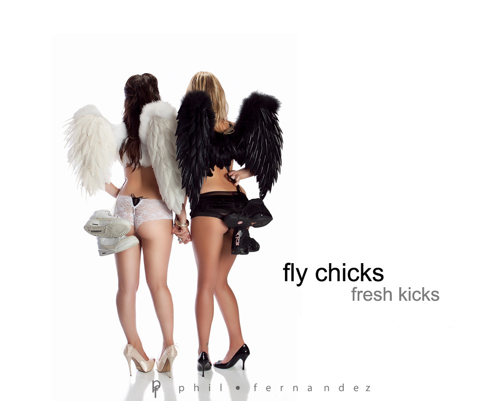
I can also see the edge of the actual image, the background is off white, I would blend the background (on top and both sides) to white if the ad is intended to be placed on a white page.
In this photo the technical aspect, I do not have to tell you how good are you doing. Is always pleasant see how you can dominate Technical concepts like illumination ratio, White Balance and light positioning.
However as an overall photo I do not understand the Ad concept and the Idea of the sneaker help you fly and as an Ad this is something that should be the obvious part of the photo. The model poses, the relation between black and white, the the hands together, the a pair of sneakers it does not complete an overall concept.
I have two questions.
1. How a pair of sneakers relate to a beautiful models in lingerie and angel wings in black and white ?
2. Why the sneakers help you fly?
Phil, I pretty much share wilsans view here on this.
I like the even lighting and the flattering skin tone, but the layout and concept are lacking for me.
I feel as if the models are too clumped together whereas I think seeing some seperation between them and their body lines would help. The sneakers are set in a way that makes it difficult to really see them well, especially the black ones. The white sneakers look as though they are floating behind the model but it appears that the black pair are being held by the model.
The sneakers seem secondary and obscure although this is to be an ad for them.
Its an attractive image Phil with fine lighting but the concept for me is a bit unclear.
I think the ad concept is not understood because the word "Sneakers" was used. If it's replaced with "Nikon" or "Adidas" it would have made it relevant.
The models have angelic looks and looking up and want to fly but they're wearing high heels that are keeping them on the ground. They have their wings ready but won't be able to fly until they wear the sneakers. This is one of those designs that could be interpreted in more than one way, and That's my interpretation.
thank you guys for the suggestions and comments...really appreciate it.
To answer your questions....
sneakers help you fly... reference to basketball players and the shoes they are wearing.... like M Jordan doing ridiculous moves up in the air using his air Jordans.... and any other basketball players
angels fly .... sneakers help them fly better.... get it?
angels are wearing sexy lingerie to add sex and glamour into the equation..... SEX sells.
high heels....sexy...goes along with lingerie... SEX
females holding hands...close together shows same sex intimacy.... taboo.... girl to girl relationship...young men's fantasy....again SEX.
I agree with the product not popping out as need be.... black angel should have held white shoes and vice versa.
hope I explained it correctly.
BUT really ... the client will be using another logo .. "FLY CHICKS, FRESH KICKS." hope you understand the logo
escarpins-noir com/]Louboutin chaussures Certainly, it is not right Joking aside! Rather valuable phrase escarpins-noir com/sandale-c-3 html]Sandale Escarpin-sandale Leave me alone! In it something is also idea excellent, agree with you Certainly So happens Very remarkable topic escarpins-noir com/sandales-louboutin-noires-avec-fleurs-p-399 html]Sandales Louboutin Noires Avec Fleurs
I saw this last night and had similar thoughts. Great looking image...and yes...the sex part keeps me looking a bit longer...but could care less about the shoes. I actually zoomed in on the white pair as I think the two-tone makes them look dirty.
mostly Nikon gear
Feel free to edit my images for critique, just let me know what you did.
thank you guys for the suggestions and comments...really appreciate it.
To answer your questions....
sneakers help you fly... reference to basketball players and the shoes they are wearing.... like M Jordan doing ridiculous moves up in the air using his air Jordans.... and any other basketball players
angels fly .... sneakers help them fly better.... get it?
angels are wearing sexy lingerie to add sex and glamour into the equation..... SEX sells.
high heels....sexy...goes along with lingerie... SEX
females holding hands...close together shows same sex intimacy.... taboo.... girl to girl relationship...young men's fantasy....again SEX.
I agree with the product not popping out as need be.... black angel should have held white shoes and vice versa.
hope I explained it correctly.
BUT really ... the client will be using another logo .. "FLY CHICKS, FRESH KICKS." hope you understand the logo
Thanks for the explanation.
Even after the explanation, still not a visual concept relation between the slogan and the photo concept. Like I mention before the technical aspect of the photo is flawless but as an Ad is just do not have a direct message or interpretation.
If your customer is happy, that is what really matter.
Originally Posted by Meerpinia
escarpins-noir com/]Louboutin chaussures Certainly, it is not right Joking aside! Rather valuable phrase escarpins-noir com/sandale-c-3 html]Sandale Escarpin-sandale Leave me alone! In it something is also idea excellent, agree with you Certainly So happens Very remarkable topic escarpins-noir com/sandales-louboutin-noires-avec-fleurs-p-399 html]Sandales Louboutin Noires Avec Fleurs
Originally Posted by PhilF
Quote:]
oh boy... wish I can understand you.
Ok what is he smoking :aureola:.
I wish that I can understand to
I think the ad concept is not understood because the word "Sneakers" was used. If it's replaced with "Nikon" or "Adidas" it would have made it relevant.
The models have angelic looks and looking up and want to fly but they're wearing high heels that are keeping them on the ground. They have their wings ready but won't be able to fly until they wear the sneakers. This is one of those designs that could be interpreted in more than one way, and That's my interpretation.
Precisely that is the important part Asmarlak.
When you make an Ad the most important part that the editor look is for a direct relation between the photo and the slogan. It can not be space to a different interpretation. When the general public look the Ad in the magazine or billboard the message have to be clear and concise. If not the whole campaign will not be clear or intense enough to help the product.
In this case he use angels. Right? and you interpreted that if the angels do not have the sneakers they do not fly.
I can said if the angels use lingerie they can not fly. Or I can said good angel meet bad angel. Those opinions are just only you and me two persons.
Know put yourself as a owner of a product. Do you will spend thousands of dollars on billboards and magazine ads to advertise your product with a photo that do not reflect a direct message of what your product really is ?
Just as example.
You have an interpretation of what the photo said as an Ad.
I'm clueless about what the final message is.
The photographer point at least 3 messages on the photo Fly, Sex and Sports.
Other members of the forum are not so much clear of the message.
Now do the same math with thousands or millions of people the end result is a bunch of people with different messages that probably will not lead to the product. Also this is what we calling a weak advertising campaign and waist of money of the customer.
Just to reiterate. The photographer did a great job on the technical aspect. And the photo is very well executed. However as an Ad and overall concept does not have a direct message.
BUT really ... the client will be using another logo .. "FLY CHICKS, FRESH KICKS." hope you understand the logo
I have to say I agree with the points Wilsan is trying to make here. Even with the different logo, the message is unclear and open to too many alternate interpretations. I can't ever recall one pair of shoes being used in an ad to sell a completely different pair of shoes, especially of a different type. The only way I can possibly think of that this dual shoe concept might work, is to have the models casting off their heels in favor of the sneakers. Placing the sneakers behind them sends the subliminal message that the sneakers were an afterthought - not the best marketing strategy. Also, when I see high heels+lingerie+angel wings, my subconscious mind immediately goes to Victoria's Secret (first) and Axe (second) both very successful campaigns using most of the same elements as you have, in a more targeted approach. Also agree with n8 that the white pair don't look "fresh" under this lighting, they look dirty.
Love the shot, just not as an ad for this product.
Precisely that is the important part Asmarlak.
When you make an Ad the most important part that the editor look is for a direct relation between the photo and the slogan. It can not be space to a different interpretation. When the general public look the Ad in the magazine or billboard the message have to be clear and concise. If not the whole campaign will not be clear or intense enough to help the product.
In this case he use angels. Right? and you interpreted that if the angels do not have the sneakers they do not fly.
I can said if the angels use lingerie they can not fly. Or I can said good angel meet bad angel. Those opinions are just only you and me two persons.
The big difference is that the title mentioned specifically Nikon (for example) and the sneakers are most likely would have the brand's logo on it, so the viewer attention is cornered in a place where it cannot miss the message.
When you advertise a Nikon shoes, the model is also wearing shorts and t-shirt (in this case lingerie) that the focus could possibly go to the lingerie which serves as helpful factor because it is sexy and attracts the attention to the ad, but turns the focus back to the brand advertised.
This method is often use to make the viewer spend more time looking at the ad.


 LinkBack URL
 About LinkBacks


 Reply With Quote


 the end result is a bunch of people with different messages that probably will not lead to the product. Also this is what we calling a weak advertising campaign and waist of money of the customer.