Photo Critique Forum

Please post no more than five images a day and respond to as many images as you post. Critics, please be constructive, specific, and nice! Moderated by gahspidy and mtbbrian.
Featured Photo
Photo by hminx

Photo by hminx
Featured Photo Archive >>
By posting on the Photo Critique forum you agree to post only your own photos, be respectful, and give back as much as you receive. This is a moderated forum and anything abusive or off-topic will be removed.
Results 1 to 10 of 10
  1. #1
    Member
    Join Date
    Nov 2011
    Location
    UK
    Posts
    181

    Beautiful sunrise

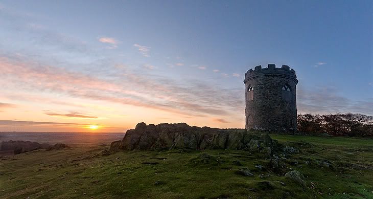
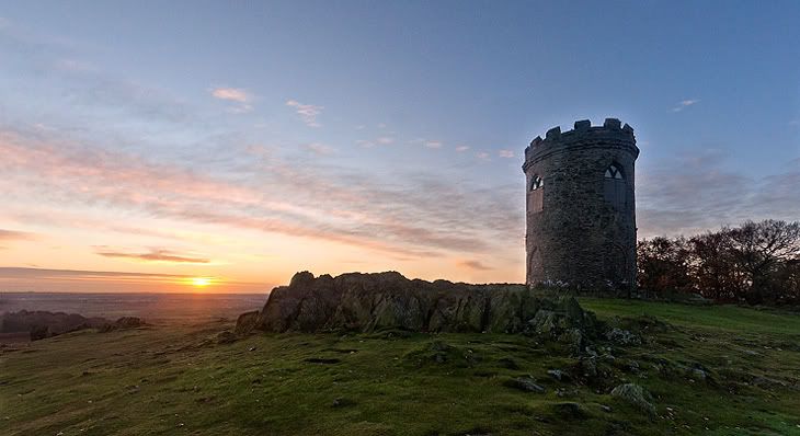
    I was lucky enough to get what was a glorious sunrise this morning. Lovely clear day and a pretty sky. Hope you like the shot. Comments and thoughts would be great.


  2. #2
    Senior Member hminx's Avatar
    Join Date
    Jan 2009
    Location
    New Zealand
    Posts
    2,154

    Re: Beautiful sunrise

    Is that structure supposed to be oval, or have you stretched this a bit ? Apart from the sharpening artifacts around the tower and rocks this looks pretty good, although I would like it a tad lighter.
    Pete

    Isn't it a cool thing in nature that the colours never seem to clash...

    I have no issues with you editing my photos

  3. #3
    Ken ksbryan0's Avatar
    Join Date
    Dec 2009
    Location
    Delphia, MT USA
    Posts
    1,160

    Re: Beautiful sunrise

    I agree with Pete, the ghosting around the tower and its distortion need to some attention.
    Ken

    My Website: His Creation
    "You miss 100% of the shots you don't take." Wayne Gretzky

  4. #4
    Member
    Join Date
    Nov 2011
    Location
    UK
    Posts
    181

    Re: Beautiful sunrise

    thank you so much for the advice and help. the tower isn't stretched at all but the shot had to be taken at an angle but i thought i had corrected the vertical distortion completely but obviously not. the hardest thing about the shot was the lighting and balancing exposures to the point that i just didn't pay enough attention to the tower shape. the rocks have a strange formation anyway but may be suffering from the same distortion as the tower which i will correct tonight and repost. i think i have a lighter version but i went for this one as it seemed more true to life. the halo is a mystery as there is no hDr in this shot. i had no idea sharpening could cause a halo. i will try to sharpen using a different technique. i noticed the halo but had no way of fixing it that i could think of. any suggestion would be great. i will try to sharpen but mask off the tower to see if that helps.

  5. #5
    Member
    Join Date
    Nov 2011
    Location
    UK
    Posts
    181

    Re: Beautiful sunrise

    Corrected as promised.


  6. #6
    Member Adamo's Avatar
    Join Date
    Oct 2011
    Location
    Temecula, Ca, United States
    Posts
    259

    Re: Beautiful sunrise

    Much better. Great shot!

  7. #7
    Member
    Join Date
    Nov 2011
    Location
    UK
    Posts
    181

    Re: Beautiful sunrise

    Quote Originally Posted by Adamo View Post
    Much better. Great shot!
    many thanks and glad you like it. Will pay more attention next time as I have taken the same shot with a very different sky without sun but more colour and I'll post it soon.

  8. #8
    Senior Member
    Join Date
    Oct 2010
    Location
    Chicago, IL, USA
    Posts
    595

    Re: Beautiful sunrise

    Overall, I think this is a very nice shot. You did very well composing it, as the position of the sun vs. the castle is very well balanced. I also like the shapes of the rocks and green grass which compliments the sky well. The 2nd shot is better than the 1st by far, but it is still too sharp, in my opinion. Also, there is a way to get a lot more light from the the grass and the castle to balance tones better. I did it on the image you posted, but I am not sure if you allow others to edit your images for learning purposes ...if you do, let me know and I can share my version. Otherwise, I would look into working on lighting using curves to bring out some more light from the darker end of the histogram ...

  9. #9
    Grumpy Old Man Overbeyond's Avatar
    Join Date
    Dec 2004
    Location
    Ireland (Now in London)
    Posts
    2,372

    Re: Beautiful sunrise

    It does seem over sharpened to me. However it is a very nice simple landscape shot with everything that's there, in good order. The second shot sorted the problems with the tower very well.
    http://www.overbeyond.com


    I have a total lack of respect for anything connected with society, except that which makes the roads safer, the beer stronger, the food cheaper, and the old men and old women warmer in the winter and happier in the summer. Brendan Behan

  10. #10
    Member
    Join Date
    Nov 2011
    Location
    UK
    Posts
    181

    Re: Beautiful sunrise

    Quote Originally Posted by llewpics View Post
    Overall, I think this is a very nice shot. You did very well composing it, as the position of the sun vs. the castle is very well balanced. I also like the shapes of the rocks and green grass which compliments the sky well. The 2nd shot is better than the 1st by far, but it is still too sharp, in my opinion. Also, there is a way to get a lot more light from the the grass and the castle to balance tones better. I did it on the image you posted, but I am not sure if you allow others to edit your images for learning purposes ...if you do, let me know and I can share my version. Otherwise, I would look into working on lighting using curves to bring out some more light from the darker end of the histogram ...
    many thanks for the reply and glad you like the shot. also thank you so much for the advice and crit. i could have tried curves or levels with a layer mask on the ground but i have a lighter exposure to blend in which is what i often do instead. the dilemma is this for me. . . do i lighten the foreground to make it easier on the eye and to show more detail, or stay more true to the scene, or should i say, more true to how i remember the scene being, ie even though the dynamic range of the eye is better than that of a camera, the foreground would still have seemed much darker than the bright sky. or have i just remembered it badly? its an interesting one as its almost art against science. art would maybe want it lighter, whereas a more realistic shot would be darker. or i could be just remembering it incorrectly km which case i am talking rubbish!

    i have a very very similar shot with a much more colourful sky from the same morning which i am working on and will be a little more light on the foreground and will post that asap. also, the sharpening excess is probably because i added a little more for the small web file so probably overdid it. many thanks.

Thread Information

Users Browsing this Thread

There are currently 1 users browsing this thread. (0 members and 1 guests)

Posting Permissions

  • You may not post new threads
  • You may not post replies
  • You may not post attachments
  • You may not edit your posts
  •