Photo Critique Forum

Please post no more than five images a day and respond to as many images as you post. Critics, please be constructive, specific, and nice! Moderated by gahspidy and mtbbrian.
Featured Photo
Photo by hminx

Photo by hminx
Featured Photo Archive >>
By posting on the Photo Critique forum you agree to post only your own photos, be respectful, and give back as much as you receive. This is a moderated forum and anything abusive or off-topic will be removed.
Results 1 to 6 of 6

Thread: Single Source

  1. #1
    Too square to be hip. almo's Avatar
    Join Date
    Feb 2003
    Location
    Sweet home Ala... Florida
    Posts
    4,749

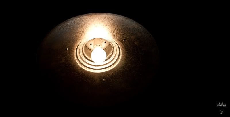
    Single Source

    I have been sitting here for a few minutes trying to think of something to say here. Well, I can't. It's a damn light.

    Any thoughts?
    John Cowan
    Always do sober what you said you'd do drunk. That will teach you to keep your mouth shut.
    ~Ernest Hemingway~

  2. #2
    Senior Member jetrim's Avatar
    Join Date
    Jul 2008
    Location
    Ft. Lauderdale
    Posts
    3,229

    Re: Single Source

    and it's a damn fine light John
    I know this is simple minimalist style so there isn't much to critique, but I like this one. I think if it were me, I'd trim a little off the left or right because it's in that odd position where it's *almost* centered, and *almost* offset.

  3. #3
    project forum co-moderator Frog's Avatar
    Join Date
    Sep 2006
    Location
    wa state
    Posts
    11,195

    Re: Single Source

    I was going to mention that it was too centered also.
    The bright whitw specks are distracting. Maybe use a spot healing brush on them.
    Keep Shooting!

    CHECK OUT THE PHOTO PROJECT FORUM
    http://forums.photographyreview.com/...splay.php?f=34

    Please refrain from editing my photos without asking.

  4. #4
    Too square to be hip. almo's Avatar
    Join Date
    Feb 2003
    Location
    Sweet home Ala... Florida
    Posts
    4,749

    Re: Single Source

    Quote Originally Posted by Frog
    I was going to mention that it was too centered also.
    The bright whitw specks are distracting. Maybe use a spot healing brush on them.
    What specks would you be refering to? There are 3 screws there, but they are a part of the fixture. As for the centering, I cropped for the leading edges of the shade. Are you guys saying I should have cropped for the bulb itself, because to me the whole fixture is the subjct.

    Thanks!
    John Cowan
    Always do sober what you said you'd do drunk. That will teach you to keep your mouth shut.
    ~Ernest Hemingway~

  5. #5
    Senior Member jetrim's Avatar
    Join Date
    Jul 2008
    Location
    Ft. Lauderdale
    Posts
    3,229

    Re: Single Source

    Don't know if it's your monitor or mine (but I recently calibrated mine) but following your last comment, I copied your photo and opened it up in PSP. I had to bump the brightness by 37 to get the full circumference of the shade to show itself. Once it did, I like the photo much better as is :thumbsup: (and yes I understood immediately the three "specks" were how the shade was attached to the fixture body )

  6. #6
    project forum co-moderator Frog's Avatar
    Join Date
    Sep 2006
    Location
    wa state
    Posts
    11,195

    Re: Single Source

    Sometimes I have to be told what it is before I can see it.
    Keep Shooting!

    CHECK OUT THE PHOTO PROJECT FORUM
    http://forums.photographyreview.com/...splay.php?f=34

    Please refrain from editing my photos without asking.

Thread Information

Users Browsing this Thread

There are currently 1 users browsing this thread. (0 members and 1 guests)

Posting Permissions

  • You may not post new threads
  • You may not post replies
  • You may not post attachments
  • You may not edit your posts
  •