Please post no more than five images a day and respond to as many images as you post. Critics, please be constructive, specific, and nice! Moderated by gahspidy and mtbbrian.
By posting on the Photo Critique forum you agree to post only your own photos, be respectful, and give back as much as you receive. This is a moderated forum and anything abusive or
off-topic will be removed.
Photography Software and Post Processing Forum Moderator. Visit here!
-----------------------------------------------------------------------------------------
Feel free to edit and repost my photos as part of your critique.
-----------------------------------------------------------------------------------------
I like it GB. I think it needs to be a little wider on the right and include all of the support line off of the pole or just clone it. Looks a little HDRish around the poles and horizon, halos or maybe and ND grad? Nice find.
I am like Barney Fife, I have a gun but Andy makes me keep the bullet in my pocket..
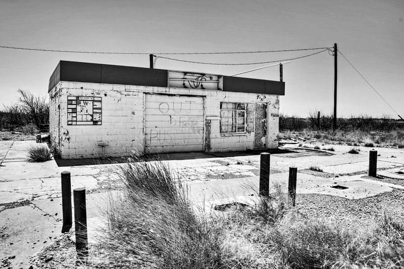
Thanks fellows. Greg, you're right in that it's an HDR... I shot this eyesore in full mid-day sun, so I though that an HDR might help balance things out better (I really didn't know..). When I compare it to the middle exposure shot (uploaded here) I see that it really didn't correct things too much.
Note that this is in general one of the big problems I have shooting on a road trip: you find a great little place to photograph, but the time of day - hence lighting - is wrong, and you know you really need to catch it at sunrise or sunset. But you can't wait that long for each little spot you find.. I guess it all depends how badly you want the ideal lighting for the photo.
Thanks too Jet, I shot a lot of photos out there, but instead of concentrating on cactus, I went for buildings like this (I think I'm done with cactus for awhile). There's so many old decrepit old places out there to shoot you could publish a few books on them.
Here's the middle exposure:
G
Photography Software and Post Processing Forum Moderator. Visit here!
-----------------------------------------------------------------------------------------
Feel free to edit and repost my photos as part of your critique.
-----------------------------------------------------------------------------------------
Thanks Don. I only converted it to B&W because the mid day colors looked blah, but it appears that it added to the 'old' feeling here.
G
Photography Software and Post Processing Forum Moderator. Visit here!
-----------------------------------------------------------------------------------------
Feel free to edit and repost my photos as part of your critique.
-----------------------------------------------------------------------------------------
Looks like it's just me...anyhow, I find it looks flat as is. Since you said you took it under bright sunlight, I'd expect a bit more contrast similar to this:
AE, N8 - I agree that the non-HDR is flat, and maybe the HDR too to a lesser extent, but the edit goes too far for me as the bright areas just seem on fire. Maybe somewhere between the two would be best?
Btw, AE, I've noticed that sometimes (or most of the time) converting digital color to B&W flattens it out. There's some plug-ins that do much better, but they're expensive.. one I think costs $300.
G
Photography Software and Post Processing Forum Moderator. Visit here!
-----------------------------------------------------------------------------------------
Feel free to edit and repost my photos as part of your critique.
-----------------------------------------------------------------------------------------
AE, N8 - I agree that the non-HDR is flat, and maybe the HDR too to a lesser extent, but the edit goes too far for me as the bright areas just seem on fire.
Feel free to check their RGB values
Maybe somewhere between the two would be best?
I did notice once the posted shot seems to be more contrast than it was in Photoshop. Hey, it's your shot, your call
Btw, AE, I've noticed that sometimes (or most of the time) converting digital color to B&W flattens it out. There's some plug-ins that do much better, but they're expensive.. one I think costs $300.
G
After converting the color image into b&w, you can adjust its contrast using curves, levels, high pass, dodge & burn or any other tool of your choosing. It's no different than adjusting the brightness, contrast, etc. of a color image. The job is not done after the color is gone
Btw, AE, I've noticed that sometimes (or most of the time) converting digital color to B&W flattens it out. There's some plug-ins that do much better, but they're expensive.. one I think costs $300.
G
I've found that using a gradient map adjustment layer does a far superior job of B&W conversion than desaturating or converting to grayscale. Give it a try, it's quick and easy. You'll find it with the other adjustment layers just above the layer palette.
If that isn't enough "punch" you can then convert to grayscale and go back into the same drop down menu, where you'll see "duotone" is no longer greyed out. Choose that and play with all the 2,3, & 4 ink combinations until you find something you like.


 LinkBack URL
 About LinkBacks


 Reply With Quote

 I guess it all depends how badly you want the ideal lighting for the photo.