Please post no more than five images a day and respond to as many images as you post. Critics, please be constructive, specific, and nice! Moderated by gahspidy and mtbbrian.
By posting on the Photo Critique forum you agree to post only your own photos, be respectful, and give back as much as you receive. This is a moderated forum and anything abusive or
off-topic will be removed.
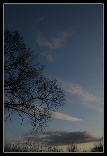
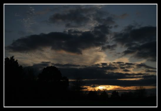
The third one appears to me to have too big a part of it too dark. The sky of it is more interesting than the first photo. For the second one, it would be better if more of the tree on the left is included in the photo. So, IMO, a better photo would be the first photo with more sky and less ground but with some of the clouds and the light from the third photo.
uh..no? lol.
But when you said "BTW, it's OK to post bigger photos", I assumed you meant what other people said when i posted them on another forum. That they're too small to critique because they didn't realize they were thumbnails.


 LinkBack URL
 About LinkBacks


 Reply With Quote

