Please post no more than five images a day and respond to as many images as you post. Critics, please be constructive, specific, and nice! Moderated by gahspidy and mtbbrian.
By posting on the Photo Critique forum you agree to post only your own photos, be respectful, and give back as much as you receive. This is a moderated forum and anything abusive or
off-topic will be removed.
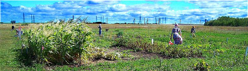
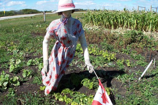
Good subject, but yeah the tops of their heads clipped off is bad. They are over-sharpened (again), IMO. Too much clutter in the background in # 1. # 2 is better, but perhaps a bit centered. I like the flag on the bottom there.
G
Photography Software and Post Processing Forum Moderator. Visit here!
-----------------------------------------------------------------------------------------
Feel free to edit and repost my photos as part of your critique.
-----------------------------------------------------------------------------------------
I actually like the top one better than the bottom which looks washed out to me. Yes #1 has a cluttered background but that does give it a sense of place.
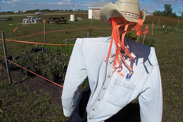
Going for some major distortion with a wide angle there?
Its a scarecrow. Good subject. I think what's lacking for that oomph factor is composition. HDR? Bluer sky? Not cutting off the head? Black and white? Shadows? These are all things to think about when framing and pushing that trigger.
--The camera's role is not to interfere with the photographer's work--
--Cibachrome: It's like printing on gold.
--Edit my photos as part of your commentary if you want to.--


 LinkBack URL
 About LinkBacks


 Reply With Quote