Please post no more than five images a day and respond to as many images as you post. Critics, please be constructive, specific, and nice! Moderated by gahspidy and mtbbrian.
By posting on the Photo Critique forum you agree to post only your own photos, be respectful, and give back as much as you receive. This is a moderated forum and anything abusive or
off-topic will be removed.
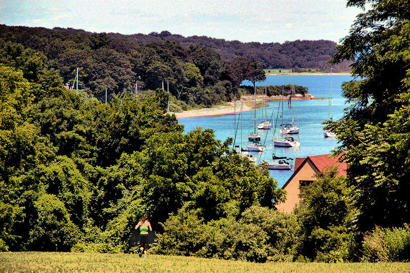
Not sure why the HDR was needed, but the quality of the image is absolutely terrible Funny how the runner is hard to see (partly because of the image quality). Too bad you didn't catch more of her closer up.
Photography Software and Post Processing Forum Moderator. Visit here!
-----------------------------------------------------------------------------------------
Feel free to edit and repost my photos as part of your critique.
-----------------------------------------------------------------------------------------
The composition of this scene is really great, although the IQ is dreadful.
I have noticed the IQ from Don's photos is almost always like this, I'm guessing it is because later it makes it easier to replicate in a painting , as he often does that
Other than that I can not understand why use this extreme PP
I like it. My only gripe is that the sand has those rainbow colors. IMO, If you can take those out it would look a bit better. The runner makes me feel like she is running to this small part of paradise.
I've noticed that your pictures are all similar when it comes to the texture/color and I've said it before... they look like a water color/paintings... almost. They are interesting to look at. I dig it. I just don't like to see those rainbow colors in areas that they don't belong like on top of the sand.
really? I am not talking about the color of the sand... I show some aqua blue and pink-ish pixels. I just find the sand in certain areas a bit distracting from the over all picture.
still, good picture! I like the direction and thought.


 LinkBack URL
 About LinkBacks


 Reply With Quote
 Funny how the runner is hard to see (partly because of the image quality). Too bad you didn't catch more of her closer up.


