Please post no more than five images a day and respond to as many images as you post. Critics, please be constructive, specific, and nice! Moderated by gahspidy and mtbbrian.
By posting on the Photo Critique forum you agree to post only your own photos, be respectful, and give back as much as you receive. This is a moderated forum and anything abusive or
off-topic will be removed.
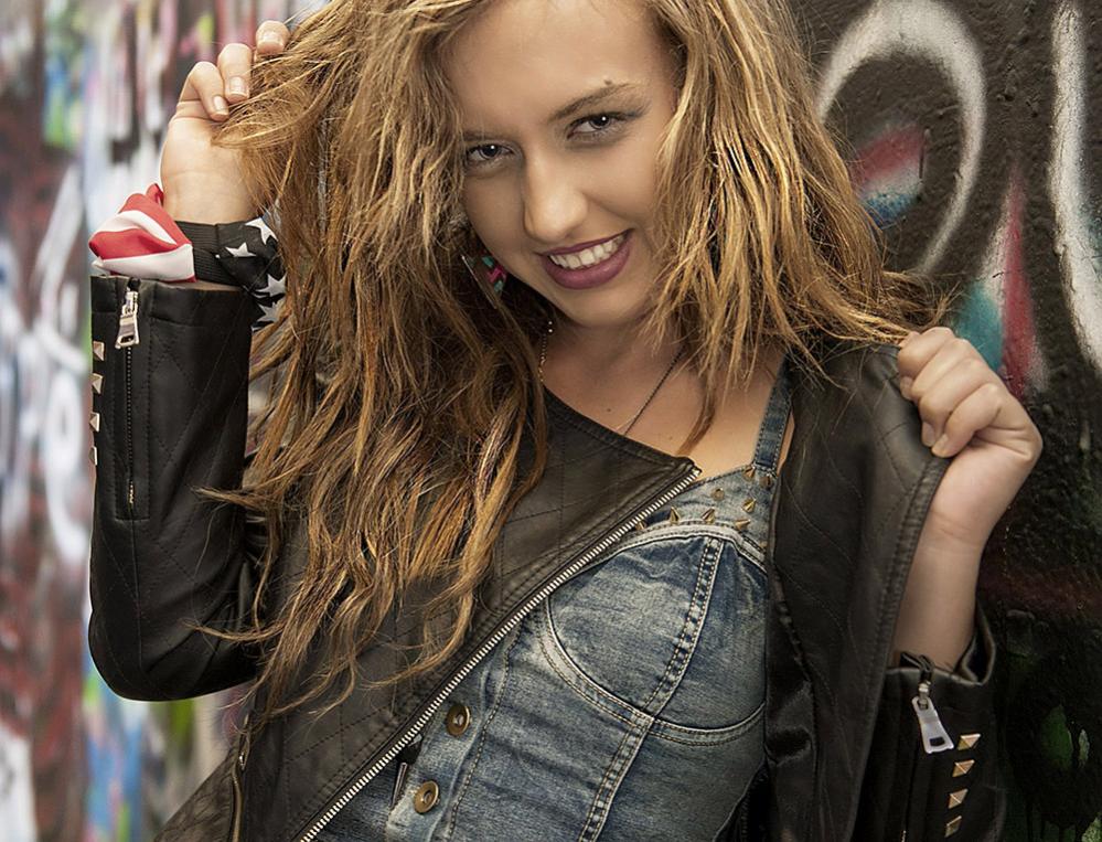
A model shoot against graffiti yesterday. C&Cs welcome.
G
Photography Software and Post Processing Forum Moderator. Visit here!
-----------------------------------------------------------------------------------------
Feel free to edit and repost my photos as part of your critique.
-----------------------------------------------------------------------------------------
Over 50 views in 3 days and no comments, so it must be perfect, eh?
Actually, I like the feel of the composition and the lighting on her face and torso is great. The fact that her hands are brighter than her face pulls my eyes away from that nice smile. Maybe brushing the hands with a little -Ev would help fix that. Same issue with the near sleeve zipper hold...it is too bright as well. Only other thing I'd like to see would be to give her a little more forehead. As is, it feels uncomfortably crowded and puts her beauty mark too close to the frame edge, making it unduly draw my attention. It is interesting that her earring is color-coordinated with the graffiti colors!
Ken
My Website: His Creation
"You miss 100% of the shots you don't take." Wayne Gretzky
Thanks for your replies. Yeah, 80 views, 2 replies, but it looks like only about 15 of the views were actually members (another 50 are probably just robots).
I see what you mean about the bright hand and zipper Ken. I went ahead and took your advice to tone that down, and I think it helps. I think I was trying to simplify it - this image is busy! but I'm not sure that hurts it, it's just a wild shot.
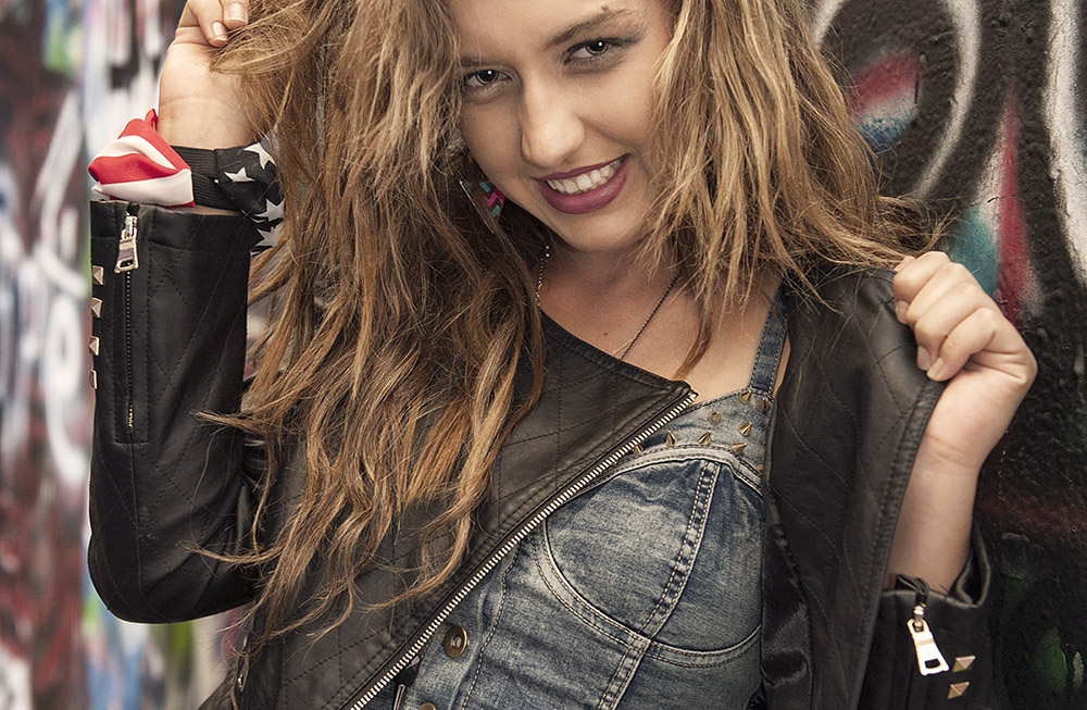
See below - I also added back her full head and hair. A friend said it looks like the 'Wild Hair 80s' (hmm). I believe you're right that the crop was a bit aggressive, but I am losing my fear of doing that these days, I guess I'm just in an experimental phase. Thanks for the good feedback on how it looks!
G
Photography Software and Post Processing Forum Moderator. Visit here!
-----------------------------------------------------------------------------------------
Feel free to edit and repost my photos as part of your critique.
-----------------------------------------------------------------------------------------
I like the wider crop much better than the first one! Besides crowding her, the first one didn't offer much context. This opens it up more and lets me see where she was. I like it.
Nice job on the edit. I actually think if you cropped the top down to about an inch above the highest part of her right-hand fingers, it gives it more of the feel I liked about the original, but doesn't seem too crowded to me. It also eliminates the rats-nest hair on the top of her head, making it more sexy and less messy!
Ken
My Website: His Creation
"You miss 100% of the shots you don't take." Wayne Gretzky
Nice job on the edit. I actually think if you cropped the top down to about an inch above the highest part of her right-hand fingers, it gives it more of the feel I liked about the original, but doesn't seem too crowded to me. It also eliminates the rats-nest hair on the top of her head, making it more sexy and less messy!
Exactly ... I like her hair but think it's too messy at the top. I just tried your crop; something about it seems off to me, but it may be personal taste. What do you think?
Thanks Matt. Deciding on crop is all Art. Besides some basic rules, like not cutting at the joints, there doesn't seem to be any 'right' way to do it. One just has to use their own judgement (and get feedback!).
Photography Software and Post Processing Forum Moderator. Visit here!
-----------------------------------------------------------------------------------------
Feel free to edit and repost my photos as part of your critique.
-----------------------------------------------------------------------------------------
Unless you're set on a specific layout dimension, I think cropping from the bottom to just under her right elbow (halfway through her left sleeve zipper pull) helps focus attention a little better. At least, I like that crop!
Ken
My Website: His Creation
"You miss 100% of the shots you don't take." Wayne Gretzky
I like the 2nd image best GB1. Her expression and pose are cool and the surrounding shes in is perfect.
The hair doesnt bother me at all since it reflects her wild, punk-like personality.
The thing i noticed was her eyes dont seem to be in perfect focus. It might be me though, but it seems a tiny bit off.
I like this crop the best, gives you full view of her and the area around her. Tho I would have left more of the wall in the shot to the left of her. Great picture eather way.
Thanks for the added comments fellows. I think this is the best one I got of her from the shoot - not perfect, but interesting.
Ken, I think cutting the zipper in half would be a problem .. The viewer's attention would zoom right to that. But it's interesting how different people have different preferences, esp with cropping (and post processing). Pls feel free to try your own crop and repost it if you have an idea that you feel's a winner.
Ctn, thanks, she did go for a wild pose. Concerning her eyes not in focus: I think I forgot to sharpen the second post, so it's a tad soft all around, due to resizing, etc.
Skip, tough one on the wall. I can see everyone having a different opinion on that - show more, show less, etc. But it is an awesome place and deserves more attention than a sterile background. See the attached image: I may try using it as source material for compositing. I intentionally used a shallow DOF on this one for that purpose ...
G
Photography Software and Post Processing Forum Moderator. Visit here!
-----------------------------------------------------------------------------------------
Feel free to edit and repost my photos as part of your critique.
-----------------------------------------------------------------------------------------


 LinkBack URL
 About LinkBacks


 Reply With Quote