Please post no more than five images a day and respond to as many images as you post. Critics, please be constructive, specific, and nice! Moderated by gahspidy and mtbbrian.
By posting on the Photo Critique forum you agree to post only your own photos, be respectful, and give back as much as you receive. This is a moderated forum and anything abusive or
off-topic will be removed.
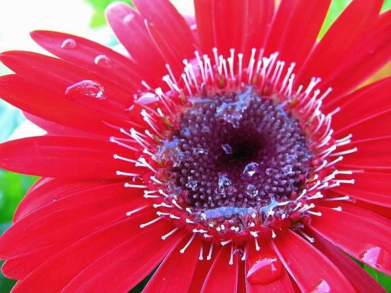
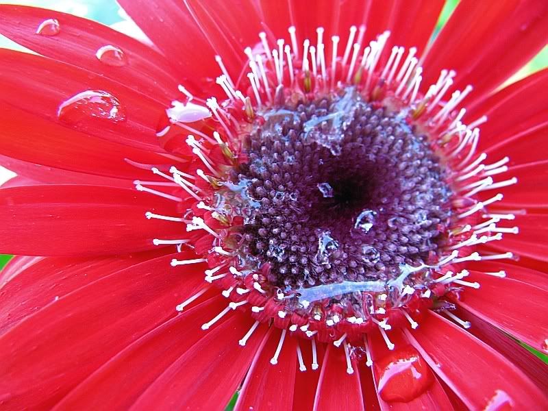
The colors are nice although a little washed out on my monitor. The real problem I see here is that the stamen doesn't pop away from the flower petals. I think you needed to shoot this from a different angle (or in the second image crop out almost of the petals and just focus on the stamen).
Yeooow! Red attack! Nice shots in that they show a powerful burst, but sthere is a lot of softness and fading out: I think the DOF was set too shallow, you could double the DOF easy in these. Excellent composition in both.
GB
Photography Software and Post Processing Forum Moderator. Visit here!
-----------------------------------------------------------------------------------------
Feel free to edit and repost my photos as part of your critique.
-----------------------------------------------------------------------------------------
I agree it is a little washed out and the depth of field us to narrow. The upper part of the flower is out of focus. I would suggest a higher f/stop next time. I think with some post processing more detail in the petals and rain drops could be brought out.
I am like Barney Fife, I have a gun but Andy makes me keep the bullet in my pocket..
The bottom photo is beautiful to me. It's quite abstract, looks like a drop/splash. The composition is right on, the drops of water balance it out even more. My eye gets distracted a little bit from the somewhat blown out corner(top left), moreso than the slightly blurred parts of the photo(i dont think this is much of a problem), maybe burn it in a bit.(top left)


 LinkBack URL
 About LinkBacks


 Reply With Quote


