Photo Critique Forum

Please post no more than five images a day and respond to as many images as you post. Critics, please be constructive, specific, and nice! Moderated by gahspidy and mtbbrian.
Featured Photo
Photo by hminx

Photo by hminx
Featured Photo Archive >>
By posting on the Photo Critique forum you agree to post only your own photos, be respectful, and give back as much as you receive. This is a moderated forum and anything abusive or off-topic will be removed.
Results 1 to 19 of 19
  1. #1
    Junior Member
    Join Date
    Mar 2009
    Posts
    4

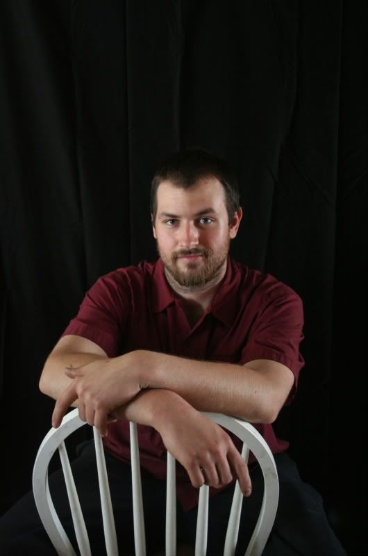
    Portrait...please critique

    Hi!

    I'm pretty new to this board as well as new to portrait photography. I was just wondering if you guys could give me some ideas of how I can improve. This was my first time shooting with umbrellas and a master & slave flash. I have a lot to learn!!

  2. #2
    banished Don Schaeffer's Avatar
    Join Date
    Apr 2006
    Location
    Huntington, NY
    Posts
    5,816

    Re: Portrait...please critique

    Technically very good.

  3. #3
    Canon 1DmkII Shooter rylan's Avatar
    Join Date
    Dec 2007
    Location
    New Brunswick Canada
    Posts
    907

    Re: Portrait...please critique

    Looks to be pretty good, i would crop the space above his head.... that way its a tighter frame and i think it would overall improve the shot
    Canon EOS 30D | EF 70-200mm f/4L | EF 85mm f/1.8 | EF 50mm f/1.8 | Sigma 10-20mm f/4 EX | Strobist gear galore

  4. #4
    Junior Member
    Join Date
    Mar 2009
    Posts
    4

    Re: Portrait...please critique

    Thanks everyone! I'll be posting many more for critique as we go along!!

  5. #5
    Member Rocket_Scientist's Avatar
    Join Date
    Jun 2006
    Location
    Fletcher, OK
    Posts
    448

    Re: Portrait...please critique

    Looks very good. The only thing I might suggest is a background that provides a little more contrast with the subject's hair.
    tink ewe belly mooch

    I invite your casual attention to my family Photo Site

  6. #6
    Senior Member draymorton's Avatar
    Join Date
    Dec 2008
    Location
    Project Bloomberg
    Posts
    2,131

    Re: Portrait...please critique

    Not bad at all. I would crop about ½ to ¾ of the negative space and that's it.

  7. #7
    Senior Member freygr's Avatar
    Join Date
    Feb 2005
    Location
    Portland, OR, USA
    Posts
    2,522

    Re: Portrait...please critique

    Good photo but I have to agree you used the wrong back ground.
    GRF

    Panorama Madness:

    Nikon D800, 50mm F1.4D AF, 16-35mm, 28-200mm & 70-300mm

  8. #8
    Junior Member
    Join Date
    Mar 2009
    Posts
    4

    Re: Portrait...please critique

    Thanks again everyone!

  9. #9
    Member
    Join Date
    Feb 2006
    Location
    KY, USA
    Posts
    391

    Re: Portrait...please critique

    I think just a little hair light to separate the subject from the background would help and a tighter crop. Other than that, not bad at all.

  10. #10
    Junior Member
    Join Date
    Apr 2009
    Location
    indiana
    Posts
    38

    Re: Portrait...please critique

    First, opinions are like ... - everbody has one!

    In my opinion the hands ruin this shot. They are grotesque, being inordinate in size because they are closer to the cam. This effect is pronounced by the aperture - far more than it would be to the eye.

    A portrait is not a place for freaky effects? If you agree, the hands is something you might consider next time you shoot.

  11. #11
    Member Rocket_Scientist's Avatar
    Join Date
    Jun 2006
    Location
    Fletcher, OK
    Posts
    448

    Re: Portrait...please critique

    Quote Originally Posted by TheDigitalMage
    In my opinion the hands ruin this shot.
    Oh... I dunno... I'm just a casual P&S kind of guy, and far from an expert, or even a professional, but...

    While I concede that the hands present a disproportionate distraction, it is the kind of thing one learns how to correct with experience in positioning both the subject and the camera, but hardly ruins the shot... in my opinion. Even with too little definition of the outline of the subject's head, it still offers a pleasant coordination of a white chair, a maroon(?) shirt, and an otherwise dark background. Wish some of my portraits were this good...
    tink ewe belly mooch

    I invite your casual attention to my family Photo Site

  12. #12
    Junior Member
    Join Date
    Mar 2009
    Posts
    4

    Re: Portrait...please critique

    Thanks guys. I really appreciate all the comments. I didn't pose him or anything we were just shooting off the cuff.

    Hopefully, I'll post more in a few days!

  13. #13
    Senior Member Anbesol's Avatar
    Join Date
    Mar 2006
    Location
    Kansas
    Posts
    3,430

    Re: Portrait...please critique

    looks like you have your main on your left and the fill on the right - I would increase the fill's power or move it a bit closer in. He also seems to be blending a bit too much with the backdrop - I would illuminate the back of him a bit more (throw a light across his back/the backdrop) to provide the contrast between the two. I would also shoot this particular shot a bit higher up, looking down, with his chin up a bit.

    As far as the backdrop goes, I don't know what kind of fabric it is and or what give it has, but if at all possible I would wrap and tie it up to get a nice rounding fold in the back, so its not just a few straight down wrinkles, and it adds a quality to the negative space.

    Good expression, good posture, but get him to close those index fingers. You'll start to notice the more people you shoot - they all want to do weird things with their fingers, and you need to tell them to knock it off ;).

  14. #14
    Member Ptax's Avatar
    Join Date
    Dec 2007
    Location
    Springfield, missouri
    Posts
    392

    Re: Portrait...please critique

    The face and eyes are what draw a viewer into a portrait and help them connect with the subject. My suggestion would be to get closer to the face. The wrinkles in the background are a distraction.

  15. #15
    GB1
    GB1 is offline
    Moderator GB1's Avatar
    Join Date
    Feb 2004
    Location
    San Diego CA
    Posts
    9,960

    Re: Portrait...please critique

    The best way to separate a model's hair from the background is either to use a different color backdrop (which I don't suggest here, as the background's color is ncie) or use a spot light to illuminate it from (roughly) behind. You should really sharpen the image up a bit too.

    G
    Photography Software and Post Processing Forum Moderator. Visit here!

    -----------------------------------------------------------------------------------------
    Feel free to edit and repost my photos as part of your critique.
    -----------------------------------------------------------------------------------------

    My Site

  16. #16
    Leitzy! McMadCow's Avatar
    Join Date
    Aug 2004
    Location
    San Francisco, CA
    Posts
    271

    Re: Portrait...please critique

    Quote Originally Posted by Don Schaeffer
    Technically very good.

    Not so sure I agree with that. His hair is disappearing into the background and the lighting just isn't very dynamic.
    You can go without a hair light, but make it obvious as to why you made that choice. I'm just not seeing any reason for it here. All I'm seeing (not seeing) is his hair fade into nothingness.
    Also, with regards to the quality of the lighting, I'd be really surprised if you have anything more than a half stop of difference in power between your two lights. The shadow that demarcates the two sides of his face is pretty cool, but there's just nothing interesting being separated. Portrait shots are usually done with one light a stop brighter than the other. You'll find the resulting shot to look much more dynamic as well as three-dimensional.
    Something else to consider is to use a white drop instead of black. It's far more easy to control when you need light hitting it, and you can make it go pure black with your lighting anyway.
    Finally, I'd push the exposure on this up about a half stop, or so. He's looking ever so dark to me.
    Peer through the scope with an amoral code...
    -Naked Raygun

    *Arctirus helps old ladies INTO traffic.


    http://www.flickr.com/photos/mcmadcow/

  17. #17
    Junior Member
    Join Date
    May 2009
    Location
    Niceville, Florida, USA
    Posts
    3

    Re: Portrait...please critique

    True, everyone has their own opinion, but here's mine.
    I think his hands distract me from his face, which should be the main subject for a portrait shot right?
    I think the very first thing I noticed was the folded/wrinkled background. But that's an easy fix!
    I think the photo would be more pleasing to the eye if it were straight-on. It seems off angled a little bit to me.
    I would definitely crop some off of the top of the picture. Hope this might help a bit!
    Keep shooting!

  18. #18
    mod squad gahspidy's Avatar
    Join Date
    Feb 2004
    Location
    N.Y. U.S.A.
    Posts
    8,368

    Re: Portrait...please critique

    I agree with some crop suggestions from the top. I'm not feeling the pose especially the hands are working but is not too bad.
    I think much of the problem I have with this is that the focal point seems to be on the wrists. the face and eyes are soft and possibly one reason why the hands seem to gather more attention is that the hand and wrist area appears sharper and more the focal point to me.
    the eyes should be the sharpest feature and the foacl point.
    also the hair and head is getting lost in the bg. A different bg color would help or hitting the hair with a bit of light.
    please do not edit and repost my photos


    gary


  19. #19
    Member
    Join Date
    Sep 2007
    Location
    Mustang, Oklahoma USA
    Posts
    88

    Re: Portrait...please critique

    The first thing I noticed is the picture looks very soft on my monitor. I too don't like the hands placement as they look out of proportion. A third light for a hair light is also needed. I don't have an issue with the wrinkled back ground. As I too have just started using a portable studio I know how hard it is to get this right. But believe me when you do the results are fantastic.
    Nikon D300s with Nikon grip
    Nikon D300 with Zeikos grip
    Nikon D40x
    Nikkor 80-200 2.8
    Nikkor 70-300 VR
    Nikkor 18-55 Kit lens
    Nikkor 50 1.8
    Nikkor 35 1.8
    Tamron 17-50 2.8 VC
    Tamron 28-75 2.8
    SB-900
    SB-600

Thread Information

Users Browsing this Thread

There are currently 1 users browsing this thread. (0 members and 1 guests)

Posting Permissions

  • You may not post new threads
  • You may not post replies
  • You may not post attachments
  • You may not edit your posts
  •