Please post no more than five images a day and respond to as many images as you post. Critics, please be constructive, specific, and nice! Moderated by gahspidy and mtbbrian.
By posting on the Photo Critique forum you agree to post only your own photos, be respectful, and give back as much as you receive. This is a moderated forum and anything abusive or
off-topic will be removed.
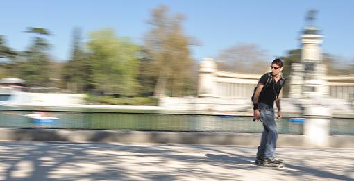
OK, I'm trying to improve my panning. Of the shots below can you pick the one you like the most. If you have a moment just say why, else just the pick will do. (Photos from my trip to Madrid - Spain this week) Cheers, Shootme
:thumbsup: Shootme...
Please don't edit and re-post or use my images (not that you'd want to anyway...). without my written permission. Thank you
I'd have to say that I prefer the fourth one. I think that I like it best largely because of the color in the figure. Some of the others seem to be washed out a bit because of the motion but that one works well because of how bright the shirt is against the background. Also, I think maybe it's due to the focus area as well.
I would have to agree that I like #4 the best. However I feel that #2 is actually focused the best. I think the background blur in #4 shows how much faster she was moving and therefore the slight out of focus subject isn't as noticeable.
Canon EOS 6d w/Battery Grip
Canon EOS 620
Canon EOS Rebel G
Canon EOS Rebel XS
Canon EF 24-105mm f/4L IS USM
Canon EF 85mm f/1.8 USM
Canon EF-S 18-55 f3.5-5.6 IS
Canon EF 25-80mm f4-5.6 III
Canon EF 70-210mm f4
Canon 35-70 f3.5-4.5
Canon Lens EF 50mm f1.8
Promaster FTD 6500M
Canon Speedlite 420ex
Yongnuo Speedlite YN560-II
They aren't big enough to see how well you panned on the subject, or how well you focussed on them.
I think you have issues with both pan and focus, they just don't look sharp where they should be.
#1 looks sharp on crank, jeans, and possibly face ... but overexposed, Pan good.
#2 too wide to tell if it's sharp.
#3 looks sharp on the zip at the bottom of his jacket. Pan good, focus not on the face.
#4 too wide to tell if it's sharp. looks like she might be in focus and panned.
#5 too wide to tell if it's sharp. looks like nothing sharp.
If the full size were in the gallery, I'd be able to see better.
As panning goes, I have to say that I think you did well overall isolating your subjects and getting strong motion blur in the rest of the frame
Though I generally agree with the comments about #4, I find her pose rather static.
#3 is my choice because of the simple comp (cleanest BG) and how he's looking at you, though it would have been a stronger image if sharper and not cut off at the bottom.
I have to give #1 an honourable mention for at least bringing his helmet
Thanks all very much for the comments. I'd have to agree that I like #4 for the overall composition and impact of colour. However my favorite is #3 as mentioned by Cath for the same reasons and disappointing for the same reasons. for these shots I had the ISO at 200, speed at 1/25s and aperture around f16. For #4 I used 51 points 3D-tracking as I did for #3 and 5 with different effect though, it seemed to be all over the place with people moving all around. Anyway I'll keep trying. Cheers S
:thumbsup: Shootme...
Please don't edit and re-post or use my images (not that you'd want to anyway...). without my written permission. Thank you
If you're panning with a single subject, use just one focus point and keep it on the subject.
You will find it's rather hard to keep a corner focus point on the head of a cyclist as they pass by, but it rewards practice.
My first panning was hilarious, I think I got 1 in 50.
Even now, if I've been away from shooting for a while, it takes time to get back in the zone.
To me the most effective image is the gal on the blades. Paul had great critiques on all the photos and he's about as good as they come with this technique.
Don't forget about the Gallery. Are your photos there??
Nikon Samurai #13
"A photographer is known by what he shows not by what he throws. The best photographers have the biggest trash cans." Quote from Nikon School sometime in the early 1970's.
I think we are all drawn to the 4th image because the woman seems attractive and the hair adds a feeling of movement yet her face is hidden so it could be almost anyone.
Your panning in these examples seems fine so the results depend on the viewers impression of the subject.
1, 2 and 4 are the sharpest and hence the best IMO. 2 & 4's color also adds to the shot. Good work, keep shooting these. You are getting good though not perfect results, so I would be encouraged to keep shooting.
I also like your backgrounds instead of just a normal ol' background. !
G
Photography Software and Post Processing Forum Moderator. Visit here!
-----------------------------------------------------------------------------------------
Feel free to edit and repost my photos as part of your critique.
-----------------------------------------------------------------------------------------
Thanks OT, MB1 and GB1. I like trying to take these shots and will keep practicing. I purposely tried to have the monument background in the shot, glad you liked it G. S
:thumbsup: Shootme...
Please don't edit and re-post or use my images (not that you'd want to anyway...). without my written permission. Thank you
Also, I give you HUGE kudos for doing as well as you did here, panning takes A LOT of practice. You're coming right along and, I'm anxious to see how well you do next time.
My Best to You,
Penny
My love for others is NOT conditional on their meeting my standards.