Please post no more than five images a day and respond to as many images as you post. Critics, please be constructive, specific, and nice! Moderated by gahspidy and mtbbrian.
By posting on the Photo Critique forum you agree to post only your own photos, be respectful, and give back as much as you receive. This is a moderated forum and anything abusive or
off-topic will be removed.
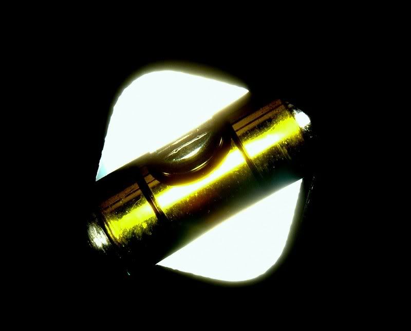
thats cool looking shot, it took me a while to understand what it was...then i looked at the title. It's really interesting, but the scratches on the level bubble thingy are buggin' me. You should try to boost the saturation so it gets more of the greenish/yellow look. Cool shot.
Lightroom is my Darkroom...Hahaa.
<img src="http://i81.photobucket.com/albums/j206/dmm96452/clover.jpg">
"Just Go with the FloW..."
Ohhhh yeah....feel free to edit any of my pictures.
As for this one here, the washed out center kind of takes away from the image....this is the problem with reflective objects that are cylindrical
I like the title, but also think you could have shot it differently to expres the title further, rather than simply have th light from the back and front!
The scratches are also distracting!
Nice idea though....always a joy seeing "out-of-the-box" work!
Marc
Marc
"Perfection is achieved, not when there is nothing left to add, but rather, when there is nothing left to take away." - Antoine de St-Exupery
Kindly do NOT edit my photos - I would rather try and apply your advice and learn...
I like this. The heavy saturated look works well. Maybe a touch to much negative space but the way you tilted it also works. It almost looks like a picture of a road sign. The scratches to me add to the photo and do not take away. It has a metallic tone to it that I also think works. I might would turn down the brightmess in the white area..
Greg
I am like Barney Fife, I have a gun but Andy makes me keep the bullet in my pocket..
Very nice. I like the simple graphic feel and the wash of reflected light on the edges of the hole. Some good tension here because we want the bubble to rise. Had it actually been out of level it would have felt different.
I have no problem with the blown out areas as they are interesting shapes in the abstract whole


 LinkBack URL
 About LinkBacks


 Reply With Quote