Please post no more than five images a day and respond to as many images as you post. Critics, please be constructive, specific, and nice! Moderated by gahspidy and mtbbrian.
By posting on the Photo Critique forum you agree to post only your own photos, be respectful, and give back as much as you receive. This is a moderated forum and anything abusive or
off-topic will be removed.
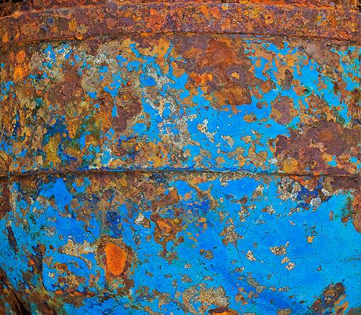
Very unusual and different, and excellent title. Not sure how the line cuts across the center but other than that subjective item I think this is a definite winner. Might look good printed BIG.
G
Photography Software and Post Processing Forum Moderator. Visit here!
-----------------------------------------------------------------------------------------
Feel free to edit and repost my photos as part of your critique.
-----------------------------------------------------------------------------------------
Hi Arne! Great contrast and colors going on here. I love these found abstracts, neat layers of paint. Normally I would agree with GB about the line in the middle except that the title implies it could be equatorial and the banding on top implies more sphere so I think it works. Looks like it was worth it to go back and get it the way you want it.


 LinkBack URL
 About LinkBacks


 Reply With Quote


