Please post no more than five images a day and respond to as many images as you post. Critics, please be constructive, specific, and nice! Moderated by gahspidy and mtbbrian.
By posting on the Photo Critique forum you agree to post only your own photos, be respectful, and give back as much as you receive. This is a moderated forum and anything abusive or
off-topic will be removed.
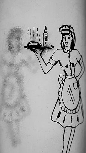
Experimenting, as usual. This is one of those condiment bottles, which is somewhat clear. I placed it on a lightbox app and aligned the images of the figure to get a shadow effect.
I like the photo, good composition and the "shadow" is perfect. I mainly would like to see it brighter, bringing it closer to white. It simply looks a little too dark. It doesn't pop as much as it could.
Great idea, I agree with dwaugh about the brightness but I wonder what this would look like if you had rotated the bottle slightly bringing the shadow and waitress more into line, this would also make it less tight on the edges.
Pete
Isn't it a cool thing in nature that the colours never seem to clash...