Please post no more than five images a day and respond to as many images as you post. Critics, please be constructive, specific, and nice! Moderated by gahspidy and mtbbrian.
By posting on the Photo Critique forum you agree to post only your own photos, be respectful, and give back as much as you receive. This is a moderated forum and anything abusive or
off-topic will be removed.
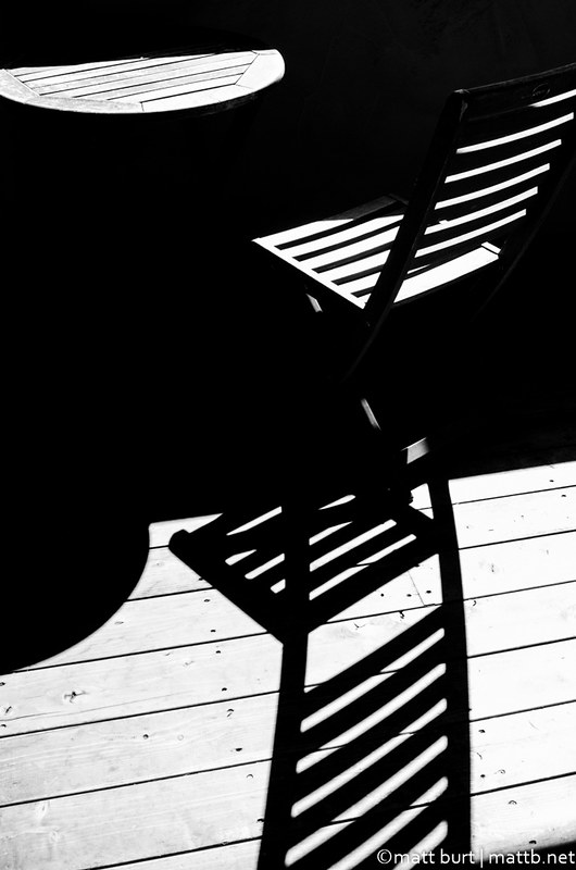
This is one of those photos that I'm not really saying anything with. Except maybe "look at this". It's from my deck and I just liked the contrast of light and shadow and wanted to see if I could come up with a semi-abstract composition to show it.
I think it'd work better without the table. Since the lines on the table's surface aren't in its shadow, that shadow behaves differently in the image than the chair does.
Very cool idea!
As a fine art image this works really well, IMO I think I might leave the table in as it gives context to the round shadow on the decking. Only thing I might suggest is to darken the shadow on the corner of the seat of the chair so it matches the other shadows.
Pete
Isn't it a cool thing in nature that the colours never seem to clash...
Thanks you guys. I kind of like the table too. Good point about the shadow. If I get a chance again I'll try rearranging things to try a with/without the table to compare. I appreciate the feedback!
Thanks Don. It was very high contrast already so I made the decision to eliminate what little detail there was in the shadow. But that was also my intention. When I saw the shadows and light areas before taking the photo I pictured an image like this so that's why there's no shadow detail. But it's definitely a matter of taste and not many images would inspire me to try for this look.
I like the starkness myself. I also like the way the photo appears to be a strict black and white, but develops into grey tones at the bottom on the wood flooring (now that I look again, I see that the round tabletop is also grey tones, but it wasn't immediately obvious).
Nice work. My only criticism is just that the composition throws me, which can be good too.
G
Photography Software and Post Processing Forum Moderator. Visit here!
-----------------------------------------------------------------------------------------
Feel free to edit and repost my photos as part of your critique.
-----------------------------------------------------------------------------------------