Please post no more than five images a day and respond to as many images as you post. Critics, please be constructive, specific, and nice! Moderated by gahspidy and mtbbrian.
By posting on the Photo Critique forum you agree to post only your own photos, be respectful, and give back as much as you receive. This is a moderated forum and anything abusive or
off-topic will be removed.
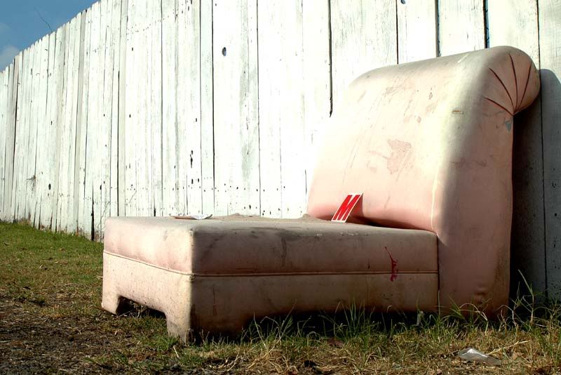
I still really dig this. I do like the grass on this one better than the first. I love how it's growing from beneath it. The only thing I don't care for are 1) The blue sky. It just doesn't seem to belong. The whiteness of the fence, the pinkness of the couch, the grass under the couch. All of that makes it surreal. But then you see the blue sky and suddenly it looks like "Oh, somebody just left some furniture in the yard" or something along those lines. 2) I wish the back weren't so blown out, causing it to blend with the fence. I do like it high, but not so much that you can't see where the back meets the fence.
Overall though, I still think it's awesome. I hope you got this in a lot of different images and at different angles. This would make a fun series.
Very graphic image. IMO the kind of image which would work great in a layout in a stylish magazine , my mind is very graphically oriented and I like for that reason.
The only thing that I would critique is over exposed spot where the chair and fence blend. It's very bright there. Other than, great job.
Edit: I haven't read D's critique before posting mine and I see she agrees with the spot also.
Liban
"There is nothing like returning to a place that remains unchanged to find the ways in which you yourself have." Nelson Mandela
This is a very interesting and strong graphical image !! Somehow i would love to see a little bit more from the seat . Those high key areas are a little concern to me tho .
The letter M is the focal point of interest, and does make this a very interesting shot in some ways. However, I think this should be in black and white, or pantone. Here is an example of a possible variant of the shot, done in a pantone and soft border. As it is, it is "unframed" which I think leaves the shot unbalanced. The filter gives this a dreamy, surreal quality which works well for a shot like this.


 LinkBack URL
 About LinkBacks


 Reply With Quote


