


 LinkBack URL
 About LinkBacks
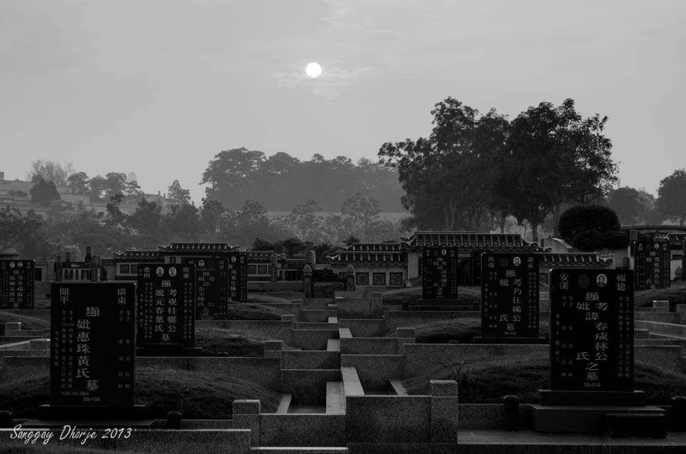
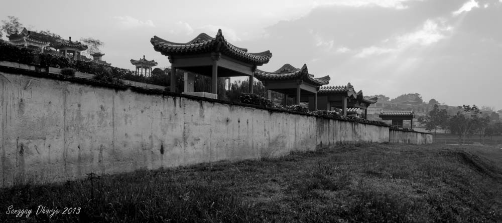
This is a modern Chinese cemetery in Malaysia or it is known as a memorial park with beautiful landscaping for the departed.
1. The tombs.
2. The wall.
I will upload 2 more photos later.
Results 1 to 6 of 6
Thread: Landscape at cemetery.Threaded View
Thread InformationUsers Browsing this ThreadThere are currently 1 users browsing this thread. (0 members and 1 guests)
|
|||||||

 Reply With Quote