LinkBack URL
 About LinkBacks

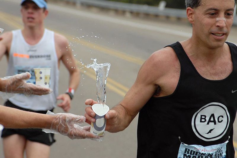
Hiya folks! Long time no talk! Here's one for the critique group, I don't do a lot of sports but wanted to know how this shot comes across.
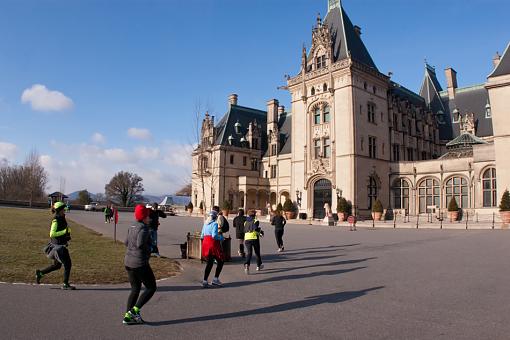
1st Asheville Marathon
Biltmore Estate, Asheville, NC
Results 1 to 8 of 8
Thread: Inaugural Asheville Marathon
Thread InformationUsers Browsing this ThreadThere are currently 1 users browsing this thread. (0 members and 1 guests)
|
|||||||


 Reply With Quote