Photo Critique Forum

Please post no more than five images a day and respond to as many images as you post. Critics, please be constructive, specific, and nice! Moderated by gahspidy and mtbbrian.
Featured Photo
Photo by hminx

Photo by hminx
Featured Photo Archive >>
By posting on the Photo Critique forum you agree to post only your own photos, be respectful, and give back as much as you receive. This is a moderated forum and anything abusive or off-topic will be removed.
Results 1 to 10 of 10

Thread: Happy Easter!

  1. #1
    Member
    Join Date
    Dec 2007
    Location
    Silesia, Poland
    Posts
    61

    Happy Easter!

    Hi

    I would like to give here my idea of Easter card.
    A lot of people are buying Easter cards. I have made my own Easter cards.
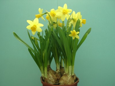
    Foto 1 is much better as it seems to me. Blooming flower-heads are seen better.
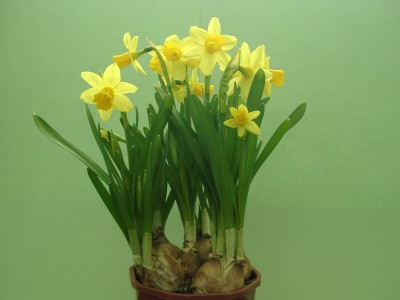
    On the second picture flowers are not seen as well as on the first. Besides the background is... "broken" by light. It is because of window-frame

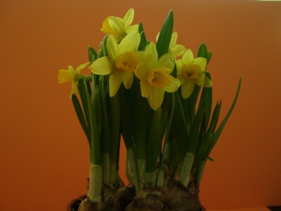
    Generally, I think the background is too dark (I will improve it) and some other mistakes are also visible but all in all not the worst I think... what is your opinion?
    What about composition? More flower-pot should be visible?

    Here we go!

    Name:  zonkil1n.JPG
Views: 113
Size:  18.2 KB

    Name:  zonkil2n.JPG
Views: 113
Size:  20.0 KB

    Thanks for your all ideas!
    Happy Easter
    green.

  2. #2
    Member Shooter Tiff's Avatar
    Join Date
    Jul 2007
    Location
    Cranbrook, British Columbia, Canada
    Posts
    204

    Re: Happy Easter!

    The first one seems a little dark but I like that you can see more of the front of the flowers in that one. Have you thought about getting in really close on a couple flowers and using them to fill the fame?

  3. #3
    project forum co-moderator Frog's Avatar
    Join Date
    Sep 2006
    Location
    wa state
    Posts
    11,195

    Re: Happy Easter!

    The yellow flowers need to pop and they don't. Might be able to bring them out in post editing. Daffodils are really good for back lighting.
    Keep Shooting!

    CHECK OUT THE PHOTO PROJECT FORUM
    http://forums.photographyreview.com/...splay.php?f=34

    Please refrain from editing my photos without asking.

  4. #4
    Member Ptax's Avatar
    Join Date
    Dec 2007
    Location
    Springfield, missouri
    Posts
    392

    Re: Happy Easter!

    Quote Originally Posted by Shooter Tiff
    The first one seems a little dark but I like that you can see more of the front of the flowers in that one.
    I agree with Shooter Tiff.

  5. #5
    Member
    Join Date
    Dec 2007
    Location
    Toronto, Ontario,Canda
    Posts
    54

    Re: Happy Easter!

    more contrast, hehe
    same with Frog, the flower should be pop out, hehe

  6. #6
    MB1
    MB1 is offline
    The Skeptical Photographer MB1's Avatar
    Join Date
    Jun 2004
    Location
    Washington, DC and Clermont, FL
    Posts
    3,144

    Re: Happy Easter!

    As you noted, the background isn't the best. Actually I think the lighting is the problem as both images look dull.

    I also think the flowers should fill the frame. There is too much empty space on the sides of the image making the flowers look small.
    No, I DON'T need that.

  7. #7
    Member
    Join Date
    Dec 2007
    Location
    Silesia, Poland
    Posts
    61

    Re: Happy Easter!

    Hi

    Thanks for your all comments. Today Easter. Look at these pictures. My yellow daffodils are ...taller somehow. And lovely I think. Next pictures soon

    Name:  daffodills_on_blue.JPG
Views: 62
Size:  22.5 KB

    Name:  daffodills_on_green.JPG
Views: 63
Size:  20.9 KB

    Happy Easter

    g.

  8. #8
    Member
    Join Date
    Dec 2007
    Location
    Silesia, Poland
    Posts
    61

    Re: Happy Easter!

    ps. Well... I hope you like the pictures with blue and green background better than the pictures with orange background. It is difficult to me to take reasonably good pictures with orange background. Why? Light is my response.
    Anyway I think my two next pictures are better than two first ones.

    Happy Easter!

  9. #9
    Member Ptax's Avatar
    Join Date
    Dec 2007
    Location
    Springfield, missouri
    Posts
    392

    Re: Happy Easter!

    I like the first pic of the second series (bluish background). The background color reminds me of a robin's egg blue which, along with daffodils, is another harbinger of spring.

  10. #10
    LRPS Alison's Avatar
    Join Date
    Feb 2006
    Location
    UK
    Posts
    2,773

    Re: Happy Easter!

    I like the blue bg better too.
    Light? Looks to me like you bounced your flash?
    Everyone here is probably going to tut and sigh but try putting them next to a window and disable the flash, to create some shadows.
    A window with a white sheet up would create some nicely diffused lighting

Thread Information

Users Browsing this Thread

There are currently 1 users browsing this thread. (0 members and 1 guests)

Posting Permissions

  • You may not post new threads
  • You may not post replies
  • You may not post attachments
  • You may not edit your posts
  •