Please post no more than five images a day and respond to as many images as you post. Critics, please be constructive, specific, and nice! Moderated by gahspidy and mtbbrian.
By posting on the Photo Critique forum you agree to post only your own photos, be respectful, and give back as much as you receive. This is a moderated forum and anything abusive or
off-topic will be removed.
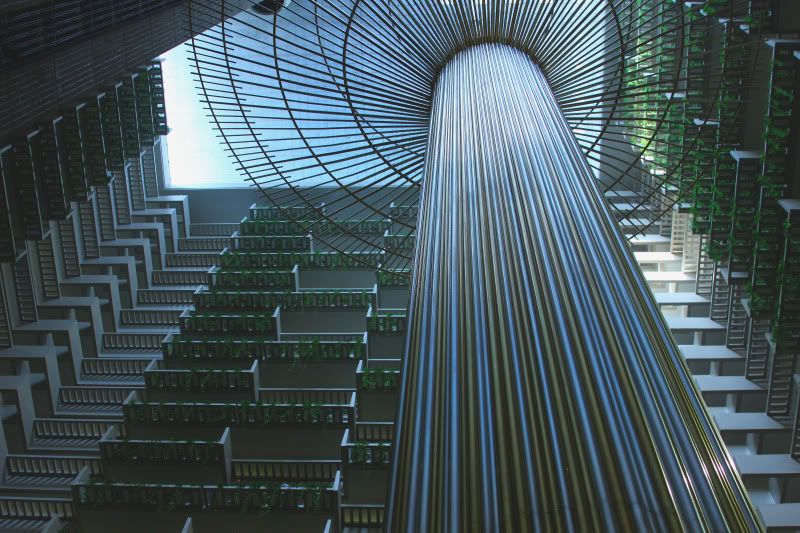
lovely lines and shapes here. i like how the pillar cuts through a third of the shadows seem a bit too heavy in this type of shot. i think i would've liked it had it had more vibrant and bright colours. but love the composition.
Liban
"There is nothing like returning to a place that remains unchanged to find the ways in which you yourself have." Nelson Mandela
Looks surreal, like it is a graphical creation (maybe in a Sci-Fi movie). I like the geometry but the only way to save the sides from going dark on your relative to the bright sky is probably an HDR. Actually, this isn't bad considering.
Somehow I don't associate a contemporary structure like this in Atlanta!
Photography Software and Post Processing Forum Moderator. Visit here!
-----------------------------------------------------------------------------------------
Feel free to edit and repost my photos as part of your critique.
-----------------------------------------------------------------------------------------
LOVE THIS! All the different shapes and the sudden shifts in the lines are awesome. I am the queen of the overdone and normally LOVE colors that scream and lots of contrast, but I am going against my nature here and saying that I think it's better with the muted colors. The lines and geometry are so strong, and the shadows so heavy, that color, to me, would simply become (and I can't believe I'm saying this!) too much of a good thing.
very cool picture. i like how my eyes travel up the post. the only thing I find a bit distracting is the bright spot on the balcony in the top right. My eyes travel up and to the right every time. awesome picture!


 LinkBack URL
 About LinkBacks


 Reply With Quote


