Please post no more than five images a day and respond to as many images as you post. Critics, please be constructive, specific, and nice! Moderated by gahspidy and mtbbrian.
By posting on the Photo Critique forum you agree to post only your own photos, be respectful, and give back as much as you receive. This is a moderated forum and anything abusive or
off-topic will be removed.
Photography Software and Post Processing Forum Moderator. Visit here!
-----------------------------------------------------------------------------------------
Feel free to edit and repost my photos as part of your critique.
-----------------------------------------------------------------------------------------
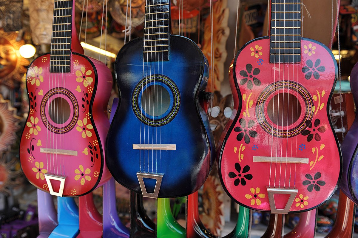
The bright light and the vertical hangers seem to be a distraction in this one Gregg. I think this is quite fixable with the clon.e tool though. Otherwise fine, some may not like the necks of the guitars cut off but it doesn't bother me.
Pete
Isn't it a cool thing in nature that the colours never seem to clash...
The bright light and the vertical hangers seem to be a distraction in this one Gregg. I think this is quite fixable with the clon.e tool though. Otherwise fine, some may not like the necks of the guitars cut off but it doesn't bother me.
Thanks for the critique Pete.. To me, it's more about the color than anything. I didn't even notice the bright light till you mentioned it. Guess that's the whole pt of posting.
G
Photography Software and Post Processing Forum Moderator. Visit here!
-----------------------------------------------------------------------------------------
Feel free to edit and repost my photos as part of your critique.
-----------------------------------------------------------------------------------------
Love this photo! I agree it's about the colors and on first glance I did nothing but like it - that's why it's our current Featured Photo
After taking a second, slower look, the one thing I believe I would have done differently is shoot it more straight-on so that the guitars were more even. I also see a bit of a curve from what I'm guessing was a wide-angle lens? To go along with a more straight-on composition, I would have also tried to use a longer, flatter lens. That might have also softened up the guitar necks inthe background and made them less of a distraction, although, to be honest, they don't bother me a bit.
Thanks PJ. I see what you mean here, and agree that it may present a more realistic, professional image. With this type shot however, I wonder if it really matters... it's more of a fun type thing. The one technical thing that I notice on it is that the DOF could have been a tad bit deeper so that the far (left side) guitar wasn't starting to fade out. I have a DOF preview button on my camera and should have used it here .. Moving too fast maybe.
Photography Software and Post Processing Forum Moderator. Visit here!
-----------------------------------------------------------------------------------------
Feel free to edit and repost my photos as part of your critique.
-----------------------------------------------------------------------------------------


 LinkBack URL
 About LinkBacks


 Reply With Quote


