Please post no more than five images a day and respond to as many images as you post. Critics, please be constructive, specific, and nice! Moderated by gahspidy and mtbbrian.
By posting on the Photo Critique forum you agree to post only your own photos, be respectful, and give back as much as you receive. This is a moderated forum and anything abusive or
off-topic will be removed.
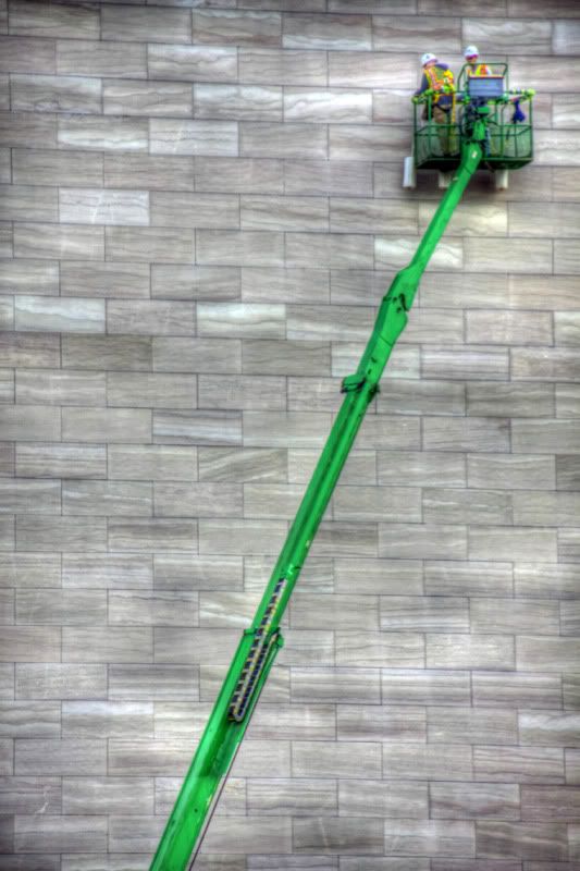
Seems you are trying to make the texture of the wall standout by doing some tonemapping
the IQ is suffering due to that process
I downloaded the original,
made the helmets near the white point
and a black point on the darkest spots on the crane arm
boosted color on the crane
played with the LCH curves on the wall to get more contrast
slight unsharp mask
does not look as extreme as the tonemapped versions
but does maintain the IQ of the original
I like the wall and the boom. Maybe try layering the tone-mapped image with a lightened original (or maybe one just tone-mapped less) and mask to let just the workers show through. - Terry
-----------------
I am no better than you. I critique to teach myself to see.
-----------------
Feel free to edit my photos or do anything else that will help me learn.
-----------------
Sony/Minolta - way more gear than talent.
I like what you spotted here Arne but my personal feeling on this is that its just too flat and a bit under exposed as well as being without adequate sharpness for this to really work something out of. I do like the subject and what you were going for.