Please post no more than five images a day and respond to as many images as you post. Critics, please be constructive, specific, and nice! Moderated by gahspidy and mtbbrian.
By posting on the Photo Critique forum you agree to post only your own photos, be respectful, and give back as much as you receive. This is a moderated forum and anything abusive or
off-topic will be removed.
Photography Software and Post Processing Forum Moderator. Visit here!
-----------------------------------------------------------------------------------------
Feel free to edit and repost my photos as part of your critique.
-----------------------------------------------------------------------------------------
I really like the composition of this photograph. The colors are well balanced, but I wonder how this would look as a monochrome image? However, this is very well done.
Yours truly,
Ron
"Enjoy and explore our nation's U.S. Highway system. You'll find an endless supply of great photo opportunities awaiting you." :thumbsup:
I really like the composition of this photograph. The colors are well balanced, but I wonder how this would look as a monochrome image? However, this is very well done.
Yeah I can see that as a possibility USRoute12. but somehow I think the glow looks better here in color. I post both here for your comparison though. I am also now thinking the full image works better - again, for your consideration. Thanks for critiquing it, also.
G
Photography Software and Post Processing Forum Moderator. Visit here!
-----------------------------------------------------------------------------------------
Feel free to edit and repost my photos as part of your critique.
-----------------------------------------------------------------------------------------
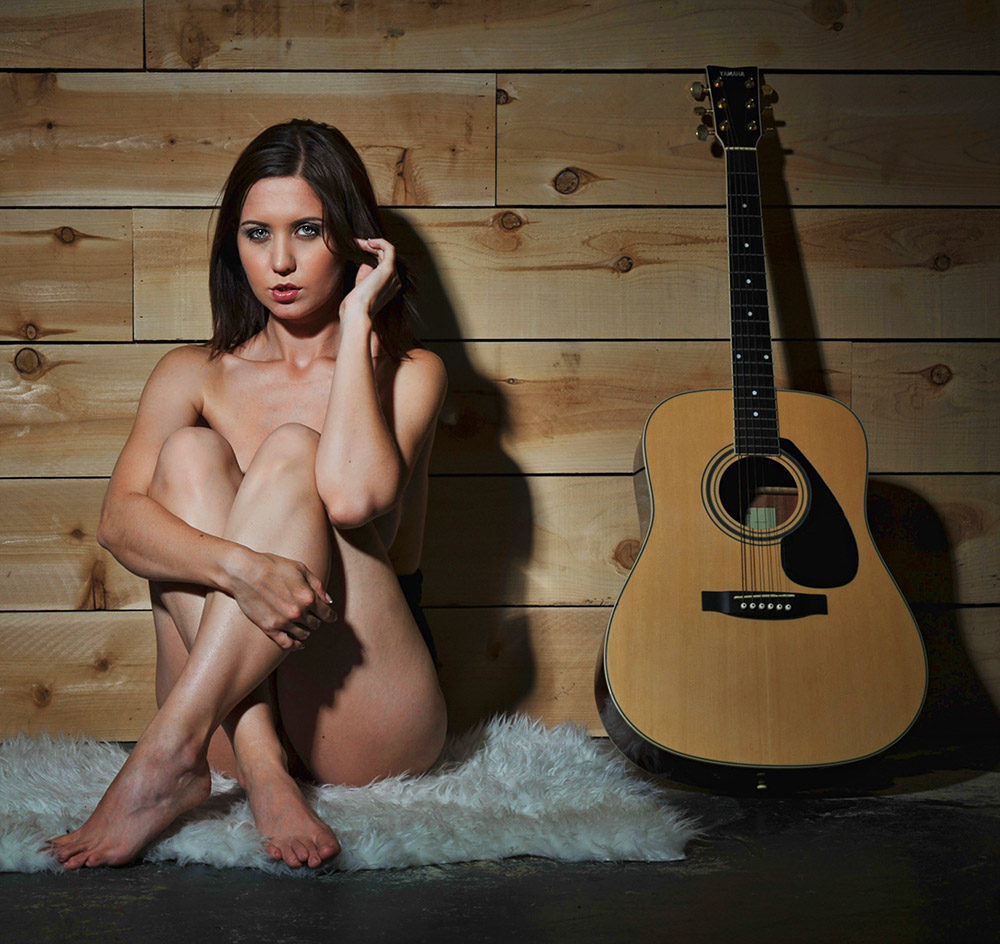
If that is "implied" nudity, I wonder what the real thing looks like!
Your focus here appears to be spot on, and the subject is good. A couple things bug me a little...the alignment of the shoes, girl and guitar are too orderly, and the girl being centered and sitting straight up is maybe the part that is too perfect. Also, the shadow of her right hand interrupts the smooth shadow along her upper left leg, and I find that distracting.
BW or color; she is striking and the comp appealing.
Ken
My Website: His Creation
"You miss 100% of the shots you don't take." Wayne Gretzky
If that is "implied" nudity, I wonder what the real thing looks like!
Your focus here appears to be spot on, and the subject is good. A couple things bug me a little...the alignment of the shoes, girl and guitar are too orderly, and the girl being centered and sitting straight up is maybe the part that is too perfect. Also, the shadow of her right hand interrupts the smooth shadow along her upper left leg, and I find that distracting.
BW or color; she is striking and the comp appealing.
Ken - I agree about the alignment of the guitar. I wanted to have it tilting a bit to create more of a diagonal, but the wall was so smooth that it was just tipping over and freaking out the model. Shadow of her right hand? Oh, that.. good eye, a finer point, but there nonetheless. I bet a painter would have made it smoother.
The good thing about this particular shot is that she's covered up. I shot a number of images, and almost all the rest are more revealing.
Appreciate the comment!!
GB
Photography Software and Post Processing Forum Moderator. Visit here!
-----------------------------------------------------------------------------------------
Feel free to edit and repost my photos as part of your critique.
-----------------------------------------------------------------------------------------
I like a lot about it but also feel the shoes, girl and guitar are too orderly and/or evenly spaced. If the shoes were a little more strewn, say with one tipped over and she was closer to the guitar so there wasn't so much even spacing I think I would like it more.
I'm a fan of B&W but I like the retro color look for this the most.
Over all a very nice image!
Thanks for commenting Matt. I liked using this studio because of it's varied backgrounds including this wall here, even though someone else mentioned that the wall also looked too perfect/orderly (I am guessing it will only work with certain scenes and models).
More from this shoot to come.
GB
Photography Software and Post Processing Forum Moderator. Visit here!
-----------------------------------------------------------------------------------------
Feel free to edit and repost my photos as part of your critique.
-----------------------------------------------------------------------------------------
Is the crop better than the original ? I like the shoes better than the guitar ...
very nice that everything is in focus
I like the colors
But something is keeping me from saying WOW! can't quite describe it, the girl looks tense , maybe not much experience doing this type of shots, was this part of a group shooting? maybe you did not get to direct her ?


 LinkBack URL
 About LinkBacks


 Reply With Quote


