Please post no more than five images a day and respond to as many images as you post. Critics, please be constructive, specific, and nice! Moderated by gahspidy and mtbbrian.
By posting on the Photo Critique forum you agree to post only your own photos, be respectful, and give back as much as you receive. This is a moderated forum and anything abusive or
off-topic will be removed.
Re: First attempts at glamor portraits/headshot....
I'm no glamour shooter but the first thing I notice is the distracting backgrounds, especially the firs two, with those window frames running into and out of her head
Re: First attempts at glamor portraits/headshot....
Really? So in a bunch of photos of a gorgeous woman, the FIRST thing you notice is the background? Ok....Sadly the windows were the source of natural light, and are regrettably built into the infastructure of the condominium and are not easily removable.
Re: First attempts at glamor portraits/headshot....
I'm no expert on glamour photography either, but you did invite our opinions...
Voting the beauty of your model is not the purpose here but rather offering advice/opinions as to how her beauty might be best shown with your camera.
I agree with Frog that your backgrounds are not especially flattering. I'm no expert, but I know that glamour in photography (and real life!) is much more the total package rather than just a pretty face.
Obviously you don't move the window -- you move the model. IMHO, some of your lighting is too harsh.
My favorite one is the one where she is lying on the red something. That's the best lighting and background, but unfortunately the position of her clothing is not flattering.
My two cents -- please don't be angry.
________________________
Paula
Your editing is welcomed. A picture is worth...
All can look. Few will see. Less will know.
The Truth can be anything it will. I just want to know Truth.
Re: First attempts at glamor portraits/headshot....
Hi NPS,
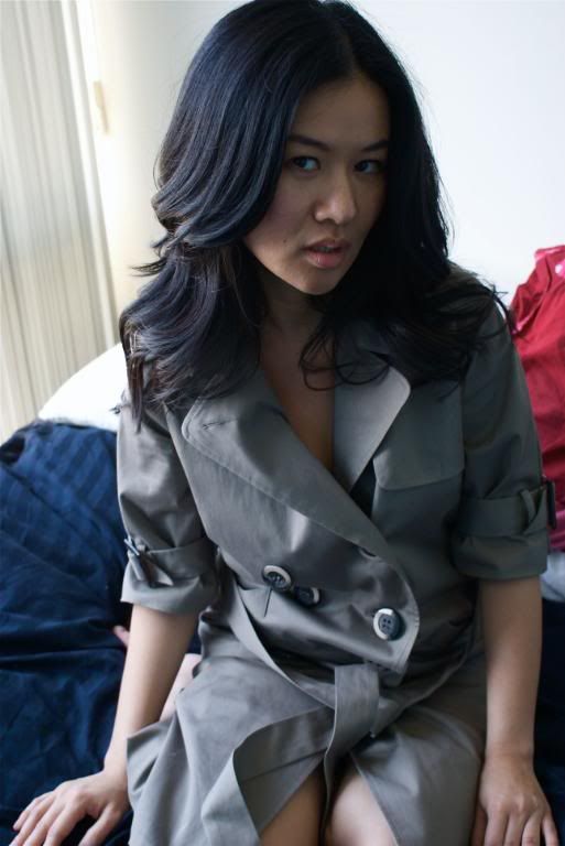
You've got a good start but your background is distracting and just another thought, if you're going to post this many, label them so you can get specific feedback on the ones that work, usually the limit is four. You have some winners here, they are diminished by having to sort through the junk to find them. Here's my list of keep and toss:
1. Toss: too blue cast, too much background, on camera flash shadow, unattractive pose, her foot is growing out of her head.
2. Toss: too much background, squinty look, less than alluring pose, it took me a while to figure out what she was wearing.
3. Keep: Softer lighting less background better facial expression would convert to black & white to loose what background distractions remain.
4. Toss: too much background better lighting but needs some fill flash. To save, I would crop away background and leave a portrait style head shot, and bring up the levels.
5. Awesome!!: Keep it!: Best of the bunch, but why did you make me dig for it? Everything about this works. Soft lighting nice accent of color without seeing too much, excellent facial expression, love the texture of her hair. The over coat lapel is a disappointment.
6. Toss: Lighting is flat and so is her expression.
7. Keep: Better lighting although could still use some fill flash hooray for a clean background.
8. Keep: but again I would do a tight cropped head shot to lose the lens flare on the top of her head and the background.
9. Toss: Although this is the one that finally clued me in to the fact she was wearing an over coat, it's just not a very alluring pose.
My comments are no reflection on the personal beauty of the subject, just how the efforts of the photographer can amplify or detract that beauty. When you are shooting "glamour" you're not exactly trying to depict the real world but create a gauzy fantasy world that shows just enough to make you wish you could peek a little more. If you want to do a re-shoot I would suggest, tight shots, more experimentation playing with the coat, a wider aperture to diminish the background and brighten the scene, maybe even tack up a backdrop so those windows aren't so extreme. Hope that helps. Keep practicing, that's the fun part anyway.
:thumbsup:
Re: First attempts at glamor portraits/headshot....
#3 is the most successful, in my opinion, not necessarily in terms of the comp, but just the overall look. I can't put my finger on why, but with some retooling, I think it could be a winner.
#s 1 and 5 also show potential, in my opinion.
I'd love to see reworkings of all of the above.
Also, look at the work of Jacob Pritchard. His environmental glamour/fashion portraits are really great - and stylistically very much in-line with what your shots here may be suggesting.
Good start.
Last edited by draymorton; 03-15-2009 at 01:18 PM.
Re: First attempts at glamor portraits/headshot....
5 and 3 are the best two in my opinion. But I'd switch up the White Balance to get a warmer look to the photos. (Number 4 is an example of the warmer light...)
Re: First attempts at glamor portraits/headshot....
Though not my thread, my thanks to CLK and Axle and all for your critiques. Though I know something is wrong, I can't yet define the fix nearly as well as you. Your time and expertise benefit many of us!
________________________
Paula
Your editing is welcomed. A picture is worth...
All can look. Few will see. Less will know.
The Truth can be anything it will. I just want to know Truth.
Re: First attempts at glamor portraits/headshot....
An admittedly cheap fix, but does obscuring the background even by cropping it away improve or help the image(s)? (disregarding the quick lasso selection)
Re: First attempts at glamor portraits/headshot....
The one thing I noticed right away was that her eyes were not in focus, and I think with any/most head shots where the subject is looking at the camera, the eyes should be in focus.... unless of course it is intentional that you have something else be the main focus.... I am just not seeing anything strong enough in focus to draw my eye in deeper...
Re: First attempts at glamor portraits/headshot....
I really liked the first shot and thought the background added to it, but in some of the other ones it took away a little. They still look great and will work fine, but if you want to look more professional I would definitely try and control what is in the background by maybe using backdrops? Other than that, good job!