Please post no more than five images a day and respond to as many images as you post. Critics, please be constructive, specific, and nice! Moderated by gahspidy and mtbbrian.
By posting on the Photo Critique forum you agree to post only your own photos, be respectful, and give back as much as you receive. This is a moderated forum and anything abusive or
off-topic will be removed.
Love the framing, lines, and faint detail in the shadows. Cool shot!
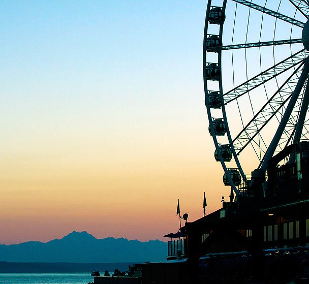
The windows add another element to the traditional sillhouette, adds some depth. (As do the zones between the mid-distance water and land, to the distant mountains, then the gradient of the sky. No matter where I start looking at this, my eye is led upward in the image back to the Ferris wheel and building below)
Hmm. I like the concept, but I wonder if the objects are strong enough. It could use a bit more area at the bottom, maybe the land right there on the shore. I suspect you clipped that off for a reason. The Ferris wheel is OK but I think I would like it better if it only showed about 3 or 4 boxes vs. all those. I love the colors of the sky near the mountain and the abstractness of the mountain shape, but there is too much uninteresting sky at the top of the image. Not sure how to fix that, as cropping may not be the answer.
A good try! Just not sure the subjects are cooperating.
G
Photography Software and Post Processing Forum Moderator. Visit here!
-----------------------------------------------------------------------------------------
Feel free to edit and repost my photos as part of your critique.
-----------------------------------------------------------------------------------------
I really like it. Great color, and we can see enough of the buildings and wheel to know what they are but not so much it makes it boring. Shadow detail helps with this too. Nice!


 LinkBack URL
 About LinkBacks


 Reply With Quote


