Photo Critique Forum

Please post no more than five images a day and respond to as many images as you post. Critics, please be constructive, specific, and nice! Moderated by gahspidy and mtbbrian.
Featured Photo
Photo by hminx

Photo by hminx
Featured Photo Archive >>
By posting on the Photo Critique forum you agree to post only your own photos, be respectful, and give back as much as you receive. This is a moderated forum and anything abusive or off-topic will be removed.
Results 1 to 12 of 12

Thread: Fashion

  1. #1
    GB1
    GB1 is offline
    Moderator GB1's Avatar
    Join Date
    Feb 2004
    Location
    San Diego CA
    Posts
    9,960

    Fashion

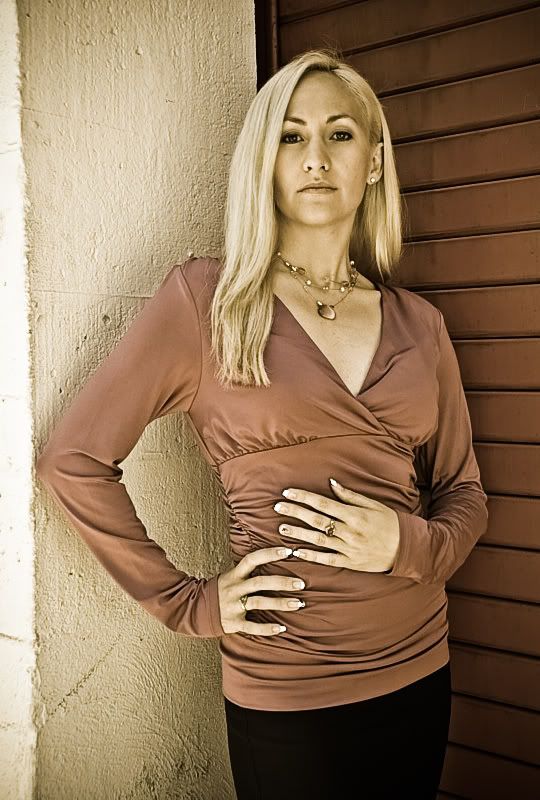
    From a recent fashion shoot. I like the shot but don't feel it's great. I need to learn to help the models find their best angles. C&Cs welcome.

    G
    Attached Thumbnails Attached Thumbnails Fashion-dsc_1753_800.jpg  
    Photography Software and Post Processing Forum Moderator. Visit here!

    -----------------------------------------------------------------------------------------
    Feel free to edit and repost my photos as part of your critique.
    -----------------------------------------------------------------------------------------

    My Site

  2. #2
    Senior Member Herriot's Avatar
    Join Date
    Jan 2003
    Location
    Singapore
    Posts
    794

    Re: Fashion

    I like that the model is staring directly at the camera in this image, with the rather uncomfortable (and uncomforting) angle of her left arm and hand I think the directness works well. Is she modelling jewelery specifically in this shot?

  3. #3
    Senior Member jetrim's Avatar
    Join Date
    Jul 2008
    Location
    Ft. Lauderdale
    Posts
    3,229

    Re: Fashion

    This actually works pretty well, given the background. If she were against a flat background I'd suggest rotating her upper body a little more to the right (about 45deg to camera) but that wouldn't work better in this corner. The flat backs of the hands are a bit overpowering, I usually try to get them to try to show the side of the hand as it's a more fluid extension of the arm (or at least 1 hand). What bothers me the most about this one is the clash between the red wall and the pink top, just doesn't feel complimentary (like I should talk - it's the same problem I had with the stool on my recent shot LOL). Wardrobe and accessories are great. Head pose works very well with the low shooting angle (projects power). Vignette defines the subject well and the lighting is set to a very complimentary ratio.

  4. #4
    mod squad gahspidy's Avatar
    Join Date
    Feb 2004
    Location
    N.Y. U.S.A.
    Posts
    8,368

    Re: Fashion

    GB, I like the look she has directly toward the camera. Her stance and atitude works, and the hands feel ok to me too. The left hand on her stomach perhaps seems a bit awkward, but I'm really not too distracted with it, it seems to work for me. Jets suggestions about the hands are good ones.
    I am only a bit confused with the lighting. There seems to be a light source coming from the camera left and maybe at waist level shining up at her, possibly just a reflector? It seems to be coming from camera left which should have her shadow on the red louvers but the shadow is on the white stucco. Not a big deal, i just was curious.
    As for the lighting my only real gripe is wanting to see her right arm illuminated a bit more, there seems to be a lot of light falloff there.
    Other than the nitpiks, its a fine shot.
    please do not edit and repost my photos


    gary


  5. #5
    Senior Member draymorton's Avatar
    Join Date
    Dec 2008
    Location
    Project Bloomberg
    Posts
    2,131

    Re: Fashion

    Very nice.

    I might say that I wish there were a little more light above/front to balance out what the reflector's doing - either that or less bounced light from below - but it's legit as is.

    My hat's off to you, man. This kind of shooting isn't easy.

  6. #6
    Senior Shooter Greg McCary's Avatar
    Join Date
    Jun 2006
    Location
    Rome Ga.
    Posts
    10,550

    Re: Fashion

    I ain't crazy about the background. It seems distracting. All those lines and bright colors.
    I am like Barney Fife, I have a gun but Andy makes me keep the bullet in my pocket..

    Sony a99/a7R

  7. #7
    GB1
    GB1 is offline
    Moderator GB1's Avatar
    Join Date
    Feb 2004
    Location
    San Diego CA
    Posts
    9,960

    Re: Fashion

    Thks for feedback.

    I'm not sure happy with this one to be honest...My biggest issue with it is her (not our view) left arm placement.. it seems to make the model look inexperienced and me too. Hmm.

    Herriot, I also like her direct eye contact. She just wore what she wanted though the shoot was corporate/fashion oriented.

    Jet, good analysis. I need to remember that hand placement tip. She preferred a 45 degree angle like you mention, but I wanted to try some more direct angles. Yeah the wall was bright and not the ideal combo w/ her shirt, but I don' t feel it's fatal. Sort of like two great colors, even if they're fighting for attention, and they work with her blonde hair. She's a fun model and with a little more practice I think I can really get some great shots of her.

    Gary, we used a silver reflector positioned to (her) left next to the wall. The other side was natural lighting but it is all balanced out pretty well. See the attached image w/o the vignette... looks like I went a little overboard with that and made her right arm too dark I am also attaching a mod on that - does it look better?

    Dray, thanks for the kind words. Yeah, maybe a little more light from above too. I don't think it has to be hard though just one of those experience things: the more you do it and learn the easier it is to get results. One thing that is nice was having other photogs there to hold the reflectors, deal with the police (they initially pulled up and said we need a city permit !!! One fellow convinced them we were not professionals and that this was just a class to which they said OK), and making the models feel at ease. It's a lot of work if you were to do it all by yourself.

    Greg, I actually like the lines as it seems to add an art deco feel. But not sure it really worked here. Yeah the colors are intense. I like it, I don't. Ahhhh..

    Here is another shot of another model with that background. I think it worked a little better with him

    G
    Attached Thumbnails Attached Thumbnails Fashion-dsc_1753_edit1_800.jpg   Fashion-dsc_1753_edit2_800.jpg   Fashion-dsc_1768_fix_800.jpg  
    Photography Software and Post Processing Forum Moderator. Visit here!

    -----------------------------------------------------------------------------------------
    Feel free to edit and repost my photos as part of your critique.
    -----------------------------------------------------------------------------------------

    My Site

  8. #8
    Senior Member jetrim's Avatar
    Join Date
    Jul 2008
    Location
    Ft. Lauderdale
    Posts
    3,229

    Re: Fashion

    I like the contrasty version a bit better, and the shot with the dude is excellent. Regarding easy/hard... it's easy to get *decent* shots but for me, this is like learning Russian - the more you learn, the harder it gets :lol: and it takes an incredible amount of work and mental focus to get an *excellent* shot.

    BTW: Fantastic to see you around again Dray!

  9. #9
    Junior Member
    Join Date
    Mar 2010
    Location
    La Vernia Texas
    Posts
    14

    Re: Fashion

    I really liked the shot, you did a great job!, however the fuchsia color of her blouse really clashed (IMHO) with the kind of barn red of the back wall...also with her bright blond hair it gave the appearance of her right side being a tad blown out? I hope you don't mind, but I played with it a bit and came up with this...I thought the colors complimented each other better, plus the texture in the stucco wall popped a little more. In addition I think the more subdued colors are more in line (compliment) the rather serious look she has on her face (if that makes sense) One other thing, minor, but the ring finger of her right hand the nail has a black spot on it? maybe it's supposed to be there, but it's kind of a distraction to me...
    Two versions...


  10. #10
    Senior Member draymorton's Avatar
    Join Date
    Dec 2008
    Location
    Project Bloomberg
    Posts
    2,131

    Re: Fashion

    I like the first of those quite a lot. The color fixes actually help things pretty dramatically.

    GB - yeah, working alone is a bitch. You tend to sweat like Albert Brooks in Broadcast News.

    Interesting story. A friend of mine (very prominent flickr presence) was recently kicked out of her favorite location. Apparently, the "student/class" line didn't work for her. Very lucky she wasn't fined.

  11. #11
    Junior Member
    Join Date
    Mar 2010
    Location
    La Vernia Texas
    Posts
    14

    Re: Fashion

    Yes, the 2nd one I did last night, and then thought better of it, and went back and got the first one. The 2nd shot, I like the lighter tone, but I think I'd go back and tone down the yellow cast to her face. There is a preset in Lightroom that's call Old photo, and I use it quite a lot (tweak it as well) but start out with it. I really like it, as it just desaturates just a tad, but gives a really nice look to most/a lot of photo's IMHO.

    Betty

  12. #12
    GB1
    GB1 is offline
    Moderator GB1's Avatar
    Join Date
    Feb 2004
    Location
    San Diego CA
    Posts
    9,960

    Re: Fashion

    Jet, Thks for the added critique. I like the guy's image better myself. Man do I agree on the great vs OK shots, and not just with models.. It seems to take a lot of planning, luck and skill to get the *great* shots. I guess that's why experienced photographers that learn more and more get better shots than amateurs. I also see that some play a digital numbers game and shoot a lot and hope one or two come out super ... Someone in the club I'm in just had a contest where you take only 3 shots or something in a model shoot with a film camera, and the best shot won a prize. Really made the photographers *think* about things BEFORE they shot. I wish I could have participated but was booked up. I may try it on myself some day soon.

    Betty, thanks and I don't mind at all on the edits! I like the 'old' look, though somehow on my monitor it seems to have added a little distortion. Maybe going desaturated would also work. And yes, the fingernail painting looks teenager-ish to me, and if I were paying for the model, I wouldn't allow it. BTW, I do most of my post processing in Corel but I really need to play w/ PS' neat stuff.

    Dray, sorry for your friend with the No Photo Zone enforcement Nazis. I am seeing and hearing about this a lot nowadays. Some people believe in opening things up and letting creative ideas happen, whereas others seem afraid of them .. 9-11 provides an excuse, unfortunately. Luckily the others were REALLY good smoozers ... not only did we get out of that one, but we walked down the street and they convinced a high rise condo sales staff to let us use the model for photos. Ha! If I tried that it probably wouldn't even be a funny story, ... they'd call the police!

    G
    Photography Software and Post Processing Forum Moderator. Visit here!

    -----------------------------------------------------------------------------------------
    Feel free to edit and repost my photos as part of your critique.
    -----------------------------------------------------------------------------------------

    My Site

Thread Information

Users Browsing this Thread

There are currently 1 users browsing this thread. (0 members and 1 guests)

Posting Permissions

  • You may not post new threads
  • You may not post replies
  • You may not post attachments
  • You may not edit your posts
  •