Photo Critique Forum

Please post no more than five images a day and respond to as many images as you post. Critics, please be constructive, specific, and nice! Moderated by gahspidy and mtbbrian.
Featured Photo
Photo by hminx

Photo by hminx
Featured Photo Archive >>
By posting on the Photo Critique forum you agree to post only your own photos, be respectful, and give back as much as you receive. This is a moderated forum and anything abusive or off-topic will be removed.
Results 1 to 7 of 7

Thread: The Doors

  1. #1
    Member chaman's Avatar
    Join Date
    Dec 2007
    Location
    Puerto Rico
    Posts
    270

    The Doors

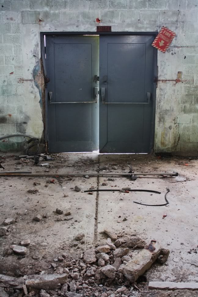
    Another one from my recent adventure at a local burned factory. I liked the crooked position of the fire extinguisher sign and how the light creeps around the doors themselves.

  2. #2
    Senior Member jetrim's Avatar
    Join Date
    Jul 2008
    Location
    Ft. Lauderdale
    Posts
    3,229

    Re: The Doors

    I like the dynamics of this shot and the composition, but there's some funky perspective distortion going on, almost like it was perspective corrected and pushed too far - the doors are smaller at the bottom than at the top (normally it's the other way around). If that were straightened up I think you'd have a winner. This also might look great as a B&W.

  3. #3
    photo gallery Mod. starriderrick's Avatar
    Join Date
    Oct 2004
    Location
    Mountain View, California, United States
    Posts
    10,487

    Re: The Doors

    Great find...If Jetrim hadn't mentioned it I wouldn't have thought twice about the distortion.Great muted colors,depth. I like everything about this AND that line that leads to the light.Very good.

    Rick


  4. #4
    Member chaman's Avatar
    Join Date
    Dec 2007
    Location
    Puerto Rico
    Posts
    270

    Re: The Doors

    I never noticed that distortion either! Quite frankly dont know what to say about it, my guess is the angle and could be more of an illusion?

    Thanks for the feedback guys!

  5. #5
    Member yetishot's Avatar
    Join Date
    Aug 2005
    Location
    Las Vegas, Nevada, United States
    Posts
    53

    Re: The Doors

    I like this alot, I would crop out the rubble in the foreground so it doesnt distract from doors and more contrast

  6. #6
    Senior Shooter Greg McCary's Avatar
    Join Date
    Jun 2006
    Location
    Rome Ga.
    Posts
    10,550

    Re: The Doors

    I agree with Jetrim. Skew the doors and maybe saturate the sign to make it stand out some.
    I am like Barney Fife, I have a gun but Andy makes me keep the bullet in my pocket..

    Sony a99/a7R

  7. #7
    Member
    Join Date
    Dec 2006
    Location
    Easton, Md
    Posts
    354

    Re: The Doors

    Good advice so far.

    I'd like to see the shot from a lower or higher perspective and maybe off at an angle.

    I'd also like to see an angled shot low with a narrow DOF........it would ask more questions of the viewer.

    Nice find

    len

Thread Information

Users Browsing this Thread

There are currently 1 users browsing this thread. (0 members and 1 guests)

Posting Permissions

  • You may not post new threads
  • You may not post replies
  • You may not post attachments
  • You may not edit your posts
  •