Please post no more than five images a day and respond to as many images as you post. Critics, please be constructive, specific, and nice! Moderated by gahspidy and mtbbrian.
By posting on the Photo Critique forum you agree to post only your own photos, be respectful, and give back as much as you receive. This is a moderated forum and anything abusive or
off-topic will be removed.
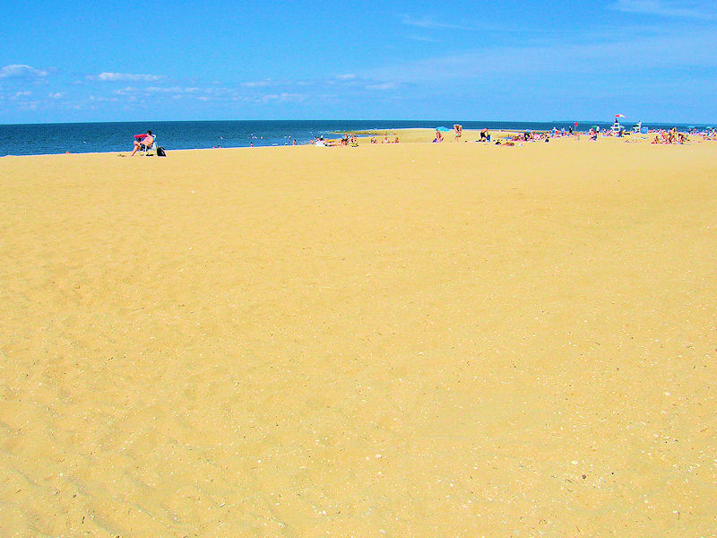
would of been better with more of a focal point, there is too much distraction. I do like the second one where you captured the the expance of the sand as a focal point.
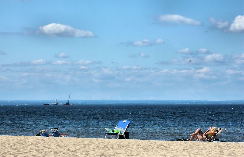
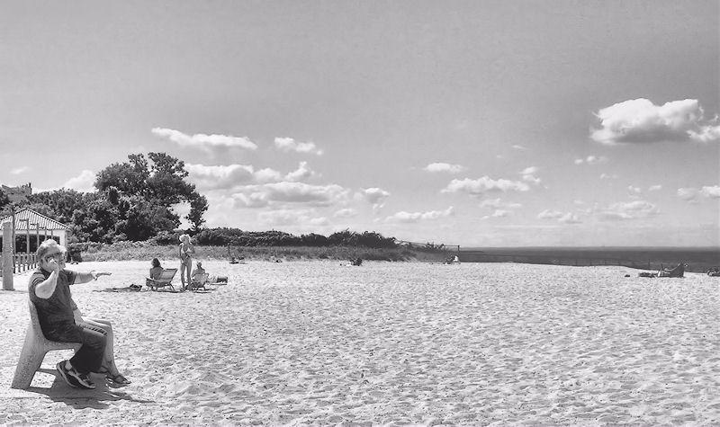
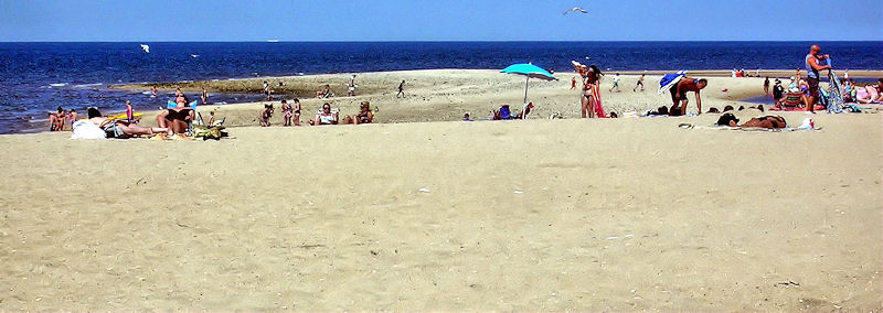
I think the black and white is the strongest image. I think having the people a little more in the photo would be better, but still, it creates an open beach feeling that works. The top one's OK too, industrial beachy so to speak. The 3rd from the top is just too saturated, and I don't see anything in the 4th. Go w/ the 2nd.
G
Photography Software and Post Processing Forum Moderator. Visit here!
-----------------------------------------------------------------------------------------
Feel free to edit and repost my photos as part of your critique.
-----------------------------------------------------------------------------------------


 LinkBack URL
 About LinkBacks


 Reply With Quote


