Please post no more than five images a day and respond to as many images as you post. Critics, please be constructive, specific, and nice! Moderated by gahspidy and mtbbrian.
By posting on the Photo Critique forum you agree to post only your own photos, be respectful, and give back as much as you receive. This is a moderated forum and anything abusive or
off-topic will be removed.
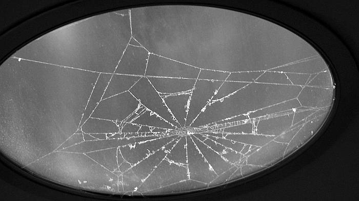
I will say one thing for you, you have come up with some very interesting photos lately. This is quite unconventional due to the shape of the image, the lighting, harsh b/w, but it is still kind of fun. Somehow it all pulls together.
Your very creative Don, I like that about you. I like the picture too. The light fixture is cut off on the left side but it still works.
Edit. Your post processing has also improved quite a bit, good work...
Greg
Last edited by Greg McCary; 12-14-2006 at 04:48 AM.
I am like Barney Fife, I have a gun but Andy makes me keep the bullet in my pocket..
You definately moved to another level in terms of vision as people noted. I like how you isolated the fixture and put emphasis on the web. This is well seen.
Don, a good subject here. I like the details of the highlighted web brought out to view. The light source being hidden helps alot. The image surrounded by the black of the room brings it out strong. Good work


 LinkBack URL
 About LinkBacks


 Reply With Quote


