Please post no more than five images a day and respond to as many images as you post. Critics, please be constructive, specific, and nice! Moderated by gahspidy and mtbbrian.
By posting on the Photo Critique forum you agree to post only your own photos, be respectful, and give back as much as you receive. This is a moderated forum and anything abusive or
off-topic will be removed.
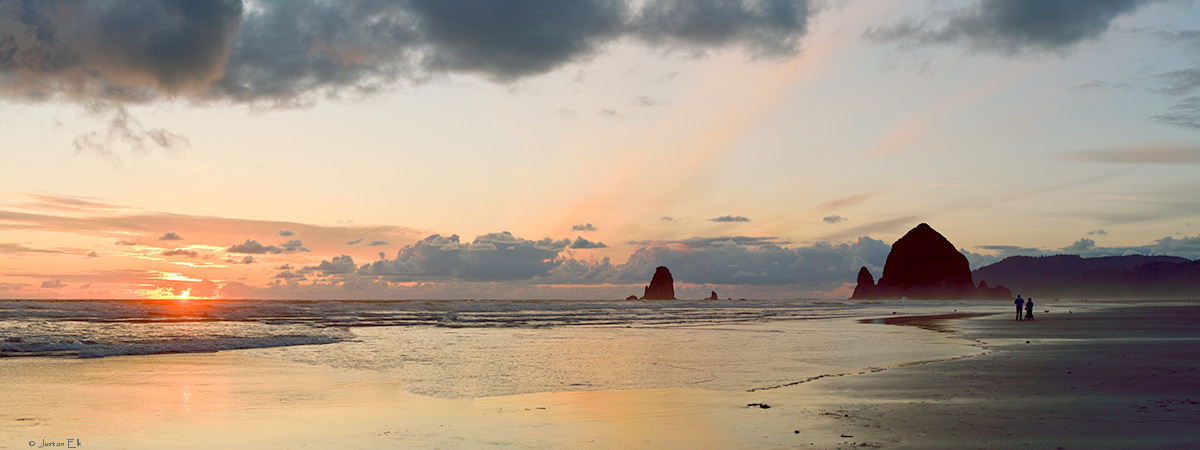
I like the first one. The inclusion of the sun adds the extra element. It does look like it needs a little pop. Maybe a touch of saturation and contrast. You might also consider cropping just a little off of the left and right.
I am like Barney Fife, I have a gun but Andy makes me keep the bullet in my pocket..
I, also, prefer the first.
Having figures on the beach adds and with two there's always that romantic feel.
They are more separated from the haystacks in the first and almost lost to them in the second.
Very well exposed.
I also wanted to see if the image tags worked because they're supposed to
I like the composition a lot. It's a bit wide and somewhat lacking in content in the middle. But you had to have the sun and you had to have the haystack rock and the people so I don't see what else you could have done. One thing I would try with this is pumping up the saturation a bit to see if you can make it pop more. I don't like oversaturated photos but usually with sunsets I find I need to work a little post-processing magic to really convey the feeling of the event.
There are lots of birds and other detail that doesnt appear at this scale. According to Photoshop, the native size of the images is roughly 25 by 66 and due to the reduction, a lot of detail is reduced to oblivion. Even my test prints, which are roughly 10 x 24 (paper size) show lots of detail lost in the jpg conversion.
Re color saturation, while sundown shots do open the door to pushing colors, and that is definitely done here, Im not a fan of pushing color until it bleeds.
Having studied these for a while, I think I may put the couple in the first image into the 2nd image. The pastel colors and reflections of the 2nd image have drawn more comments from women Ive asked, and due to that, I think it will have stronger market appeal for the family who has visited the beach and sees the work at a nearby gallery.
Both have potential. "One" is too bright, I think, but has a lot of good elements. Did you shoot RAW? If so, you may be able to play with it add some more mood.
G
Photography Software and Post Processing Forum Moderator. Visit here!
-----------------------------------------------------------------------------------------
Feel free to edit and repost my photos as part of your critique.
-----------------------------------------------------------------------------------------
Both have potential. "One" is too bright, I think, but has a lot of good elements. Did you shoot RAW? If so, you may be able to play with it add some more mood.
#1 is my preferred shot(s) here, you may want to do something about the pronounced halo above the large rock formation.
It may be due to a combination of image reduction and that there were a lot of birds on and over the large rock (known as Haystack). But there is no halo in any of the prints.
#1 is my preferred shot(s) here, you may want to do something about the pronounced halo above the large rock formation.
There is something wrong about how this site's server parses, compresses, or constrains images. It creates hallows around dark objects against lighter backgrounds especially when an icon is created from an image. I post the same pictures in other sites but I see hallows only here. Quite often you see profound hallows in an icon but you don't when you enlarge the image to 100%. I think the settings could be softened a notch.
Justan, it just seems to blind me. Whenever one shoots into the sun, we sorta expect the rest of the image to be darkish, and which produces a pretty sunset shot. But by making it an HDR, the entire scene is very bright, and although it allows one to see the other objects in the scene like the beach strollers, it seems to lose its mood. Maybe graduate from dark to light when moving left to right? (sounds tricky to do in post, but possible. Not sure what it would look like)
Photography Software and Post Processing Forum Moderator. Visit here!
-----------------------------------------------------------------------------------------
Feel free to edit and repost my photos as part of your critique.
-----------------------------------------------------------------------------------------
Justan, it just seems to blind me. Whenever one shoots into the sun, we sorta expect the rest of the image to be darkish, and which produces a pretty sunset shot. But by making it an HDR, the entire scene is very bright, and although it allows one to see the other objects in the scene like the beach strollers, it seems to lose its mood
Thank you for explaining.
Fwiw, this is most definitely not an hdr image. The scene didn’t really require it. Had I done a series to produce an hdr image the end product would have had lots of details in the haystacks, sand and distant forest, which were mostly lost here. But i checked at the time and minute details in these areas were not entirely important to the composition.
I hope you don’t mind my asking but did you base your comment on the supposition that it was an HDR capture? I know that some don’t like them…
Maybe graduate from dark to light when moving left to right? (sounds tricky to do in post, but possible. Not sure what it would look like)
In the abstract that would not be tooooo terribly difficult and would require a gradient used as an overlay and then some fixups after. But in this particular case I’m not going to find out as I’m completely okay with the way it turned out. Still you made an interesting suggestion that i'll keep in mind perhaps for use at another time.
where is this?
Cannon Beach, Oregon. A wonderful place to visit and endless foto ops.
Justan, yes, when you said 11 exposures I assumed you meant you did an HDR. I have no problem at all with HDRs btw, though a lot of people go a little overboard with them, I think.
Photography Software and Post Processing Forum Moderator. Visit here!
-----------------------------------------------------------------------------------------
Feel free to edit and repost my photos as part of your critique.
-----------------------------------------------------------------------------------------


 LinkBack URL
 About LinkBacks


 Reply With Quote