Please post no more than five images a day and respond to as many images as you post. Critics, please be constructive, specific, and nice! Moderated by gahspidy and mtbbrian.
By posting on the Photo Critique forum you agree to post only your own photos, be respectful, and give back as much as you receive. This is a moderated forum and anything abusive or
off-topic will be removed.
Photography Software and Post Processing Forum Moderator. Visit here!
-----------------------------------------------------------------------------------------
Feel free to edit and repost my photos as part of your critique.
-----------------------------------------------------------------------------------------
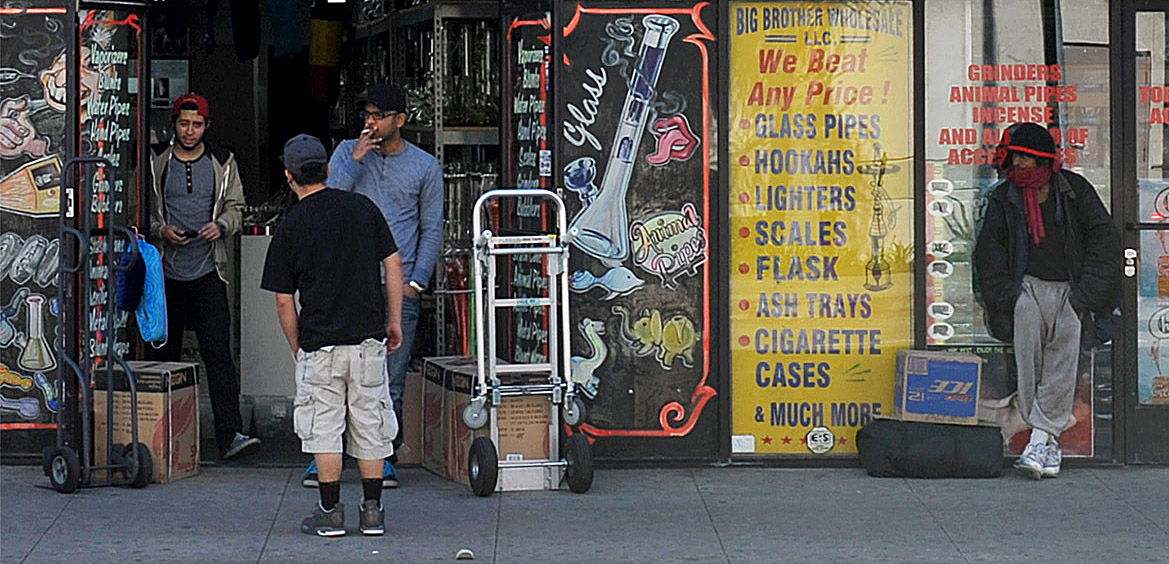
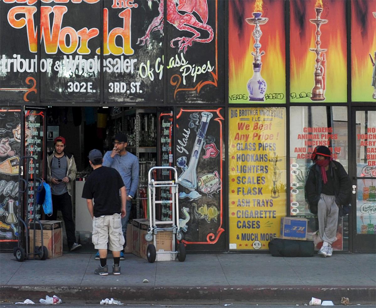
There is a lot to look at here, but my attention is constantly being drawn to the bright colors of the signage, and the people get lost. I wonder if an angled perspective would have helped "lift" the people out of the background, and maybe lessened the full-on distraction of the storefront?
Ken
My Website: His Creation
"You miss 100% of the shots you don't take." Wayne Gretzky
Love this Greg, really cool street shot, and a strong narrative. It looks a little soft though possibly cropping issue. I would like to see this a bit sharper and more contrasty
Pete
Isn't it a cool thing in nature that the colours never seem to clash...
Tks fellows. Matt (Adamo)and I got together recently and hit LA all day on a Saturday, entirely the downtown area. Quite interesting.. I'd do it again, as the grittiness makes for some good photos.
This one was cropped quite a bit. I shot almost the whole day with my 24-70mm for the better quality, but this proved to be a poor choice: I needed more range, so should have used my 24-120mm. Ken, I shot this from pretty far away, didn't know how they would take me being right up there, but your low angle idea's a good one.
Here's an adjusted version, and the unedited original. There's just so many ways to crop this one, creating very different scenes and statements.................
Photography Software and Post Processing Forum Moderator. Visit here!
-----------------------------------------------------------------------------------------
Feel free to edit and repost my photos as part of your critique.
-----------------------------------------------------------------------------------------
Looks like a very interesting scene, different from any other street photos. More like a gangland movie scene, that makes it interesting.
When I look at the photo, I find myself confused and divided by either the left hand side shop with darker colour or the right hand side bright yellows with the lone man standing.
I thought that, either cropping to show only the left part or show only right part.
With left part only, it looks cool with the "activities" going on, sort of like some street discussion of homeboys, and the look of the shop fits perfectly with the character.
With the right part only, it looks great as well, the lone man standing looks quite well matched and well positioned against the background of window frames.


 LinkBack URL
 About LinkBacks


 Reply With Quote