Please post no more than five images a day and respond to as many images as you post. Critics, please be constructive, specific, and nice! Moderated by gahspidy and mtbbrian.
By posting on the Photo Critique forum you agree to post only your own photos, be respectful, and give back as much as you receive. This is a moderated forum and anything abusive or
off-topic will be removed.
Don, I never know what to expect when I open your posts. That's a good thing.
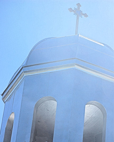
I love the effect on this one but do wish it had more space around it, especially at the top.
Hi Don,
I like the light, detail inside the tower, the great color hues.The lean works in my opinion,since you had to keep the ugly bricks off the books...the comp is effective.


 LinkBack URL
 About LinkBacks


 Reply With Quote


