Please post no more than five images a day and respond to as many images as you post. Critics, please be constructive, specific, and nice! Moderated by gahspidy and mtbbrian.
By posting on the Photo Critique forum you agree to post only your own photos, be respectful, and give back as much as you receive. This is a moderated forum and anything abusive or
off-topic will be removed.
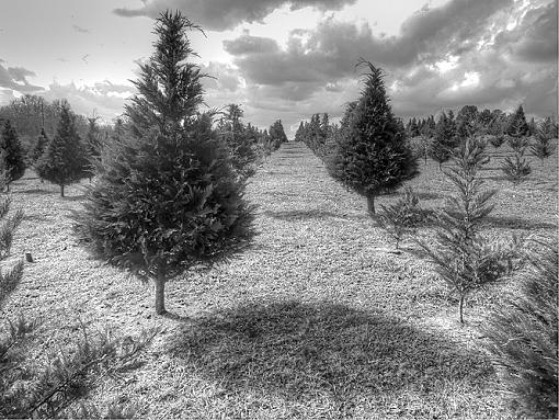
The center of the tree aisle is right in the middle of the picture , I may have turned a bit to the left to include more of the near by tree and have the end of the aisle move to the top right 1/3 intersection
I agree with armando, it seems to lead my eye right out of the main subjects. However, I actually like it! It keeps me coming back, but that might be because your post makes me try and find what errors you could be talking about. Maybe a bit more contrast like Pete said.
I like it too. The isle being centered is usually something I would try and avoid, but with the imbalance of the larger tree on one side and smaller on the other it seems to work pretty well. The foreground shadow is nice too. Good shot!
Thanks for the comments. I thought that the top of the first full tree needed more room. And i think the sky is a bit heavy clouded, needing more balance with the clear sky. Or more clouds in the clear space.
I would have to see another angle to compare, but i was attracted to this due to the center line.
I should also clone out that dark spot, far center left.


 LinkBack URL
 About LinkBacks


 Reply With Quote

")


