Please post no more than five images a day and respond to as many images as you post. Critics, please be constructive, specific, and nice! Moderated by gahspidy and mtbbrian.
By posting on the Photo Critique forum you agree to post only your own photos, be respectful, and give back as much as you receive. This is a moderated forum and anything abusive or
off-topic will be removed.
great shots in #1 & #3
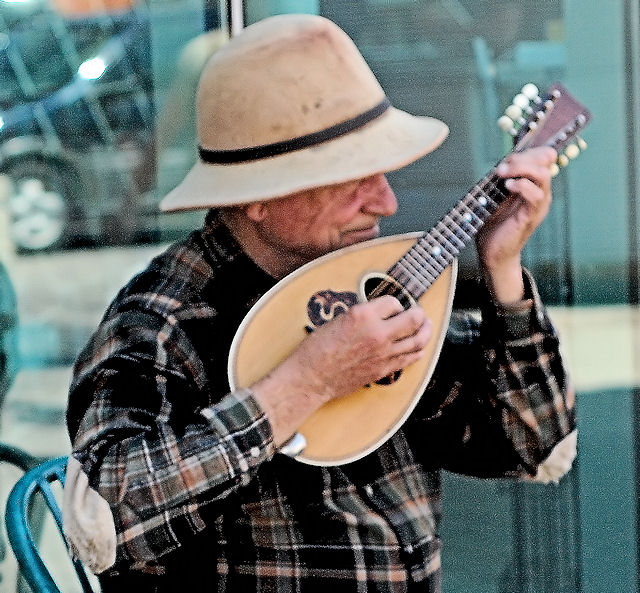
#1: seems over sharpened...maybe more impact if it were b&w
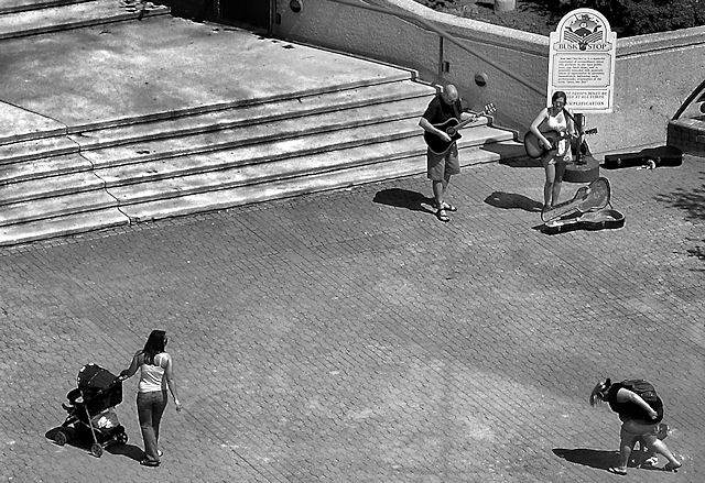
#2: seems too wide. middle is blank with action in the corners...nothing really to focus on
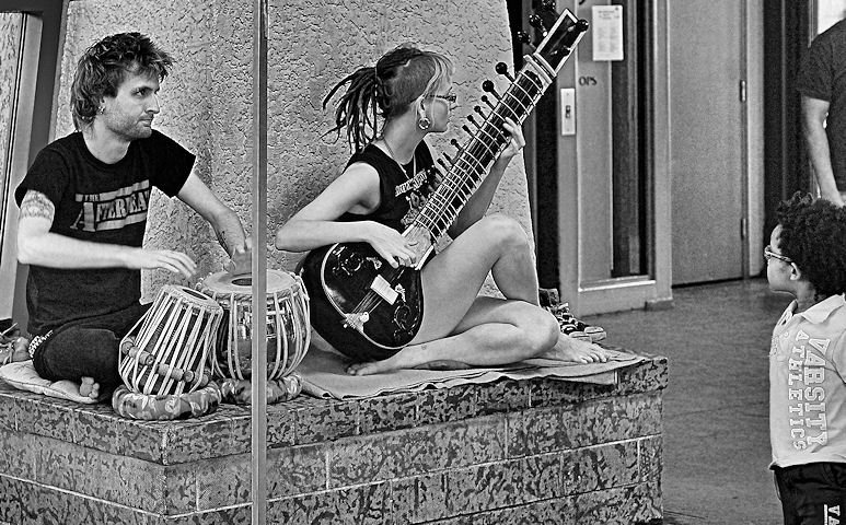
#3: great pic except for the distracting pole...
#1 Very interesting character, but I think it looks too grainy.
#2 I agree that it seems too wide. If there weren't a few random people walking by, or if they had been standing closer and had been paying attention, it would have been more relevant.
#3 I love that you included the little boy watching them (!), but the person behind him is kind of distracting, and I agree that the pole is distracting.


 LinkBack URL
 About LinkBacks


 Reply With Quote
