Please post no more than five images a day and respond to as many images as you post. Critics, please be constructive, specific, and nice! Moderated by gahspidy and mtbbrian.
By posting on the Photo Critique forum you agree to post only your own photos, be respectful, and give back as much as you receive. This is a moderated forum and anything abusive or
off-topic will be removed.
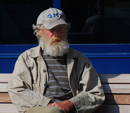
The first one is the winner here. Good color, the person isn't centered in the frame and you managed to keep shadow detail in his face. It might be a bit over sharpened.
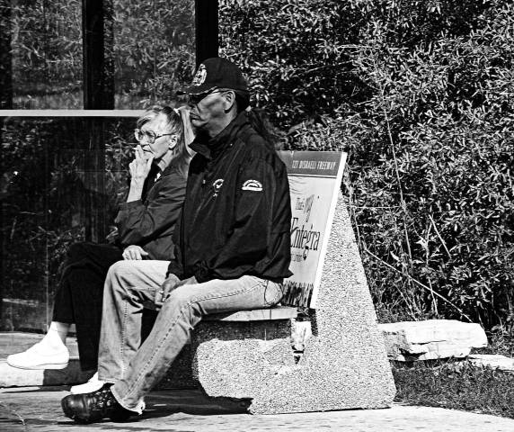
The center image has empty frame space behind the subjects who are looking to the left. You have the empty space to the right. It doesn't really work.
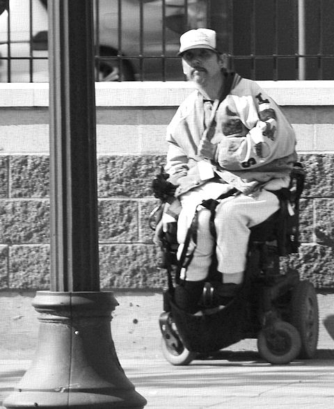
The bottom image is actually a pretty interesting look at the person but it is out of focus.


 LinkBack URL
 About LinkBacks


 Reply With Quote
