Please post no more than five images a day and respond to as many images as you post. Critics, please be constructive, specific, and nice! Moderated by gahspidy and mtbbrian.
By posting on the Photo Critique forum you agree to post only your own photos, be respectful, and give back as much as you receive. This is a moderated forum and anything abusive or
off-topic will be removed.
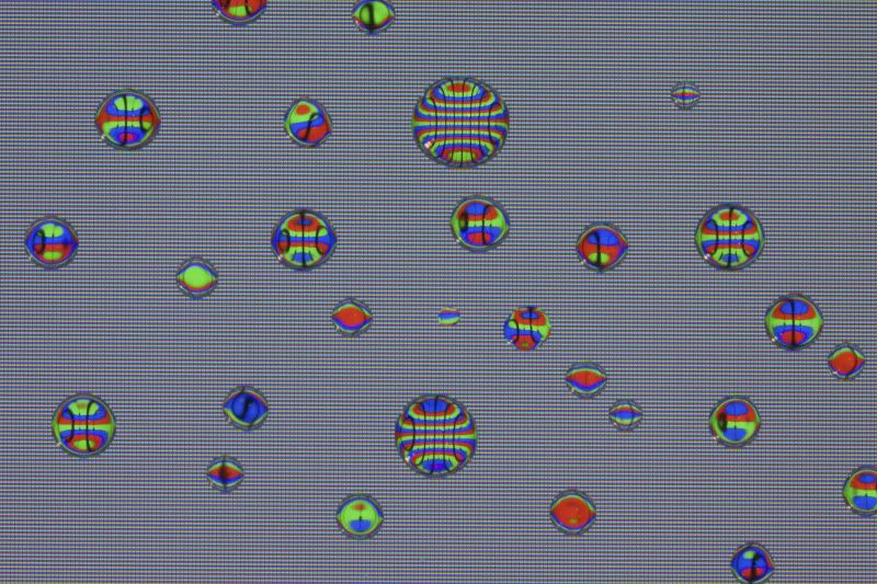
Arne - Has potential, but somehow the background doesn't quite compliment the subjects in this one. Too flat too maybe.
G
Photography Software and Post Processing Forum Moderator. Visit here!
-----------------------------------------------------------------------------------------
Feel free to edit and repost my photos as part of your critique.
-----------------------------------------------------------------------------------------
Arne - yeah, things will look flat if there's no dimensional 'clues' to other dimensions, those being things like a bubble in front of (and partially clipping) another, lighting differences on a bubble (like a sphere where part of it is dark), etc. This one actually reminds me of a 60s or 70s theme ... I think there was an art movement/phase back then (don't know how long it lasted) where simplicity and RGB colors were sort of 'in'... I LOVE those artsy phases! neat stuff fades in, usually doesn't last, but we get some neat creations.
G
Photography Software and Post Processing Forum Moderator. Visit here!
-----------------------------------------------------------------------------------------
Feel free to edit and repost my photos as part of your critique.
-----------------------------------------------------------------------------------------
Thanks for the explanation. I took this shot directly above so that I could capture the colors which might explain the lack of shadows and such. When I tried an angle, the color wouldn't be there and the color was the important factor for me. So I shall try further methods. I really appreciate your comments, it helps a lot.


 LinkBack URL
 About LinkBacks


 Reply With Quote
 I LOVE those artsy phases! neat stuff fades in, usually doesn't last, but we get some neat creations.
