Please post no more than five images a day and respond to as many images as you post. Critics, please be constructive, specific, and nice! Moderated by gahspidy and mtbbrian.
By posting on the Photo Critique forum you agree to post only your own photos, be respectful, and give back as much as you receive. This is a moderated forum and anything abusive or
off-topic will be removed.
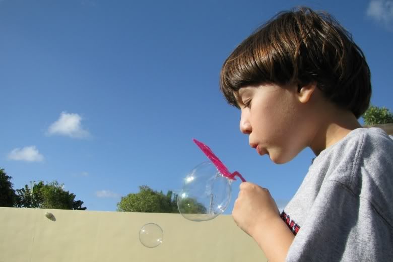
I think you did a good job of exposure under tough lighting conditions.
Basically a good image but I would try straightening to make the wall level and crop quite a bit off the left (probably from the left up to the tree in the middle of the frame). All that dead space doesn't add a thing and weakens the impact of your main subject.
I agree with MB1. However, I think the blue space would have been very effective if the subject was blowing bubbles into that area. The composition would hold together much better. Nice light. Nice colors.


 LinkBack URL
 About LinkBacks


 Reply With Quote

